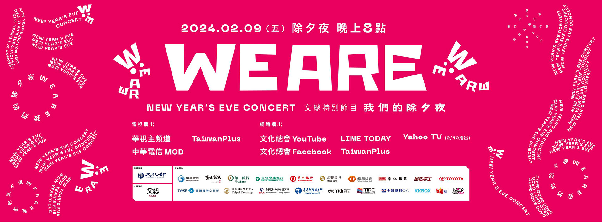
「WE ARE 我們的除夕夜」活動是由中華文化總會組織的特別跨年節目,旨在用創新的內容和懷舊的氛圍陪伴觀眾從舊年過渡到新年。該節目旨在通過融合創意和回顧元素,為不同世代創造共享的回憶。
2024年版節目囊括多個表演團體的參與,展示了豐富多樣的才藝和風格。該活動強調「共演」概念,將不同領域和世代的強大陣容集結在WE ARE舞台上,提供獨一無二的轉型體驗。
The "WE ARE" New Year's Eve event is organized by the General Association Of Chinese Culture (GACC) as a special cross-year program, aiming to accompany the audience from the old year to the new with innovative content and nostalgic ambiance. The program intends to create shared memories for different generations through the fusion of creativity and retrospective elements. The 2024 edition of the program includes the participation of numerous performance groups, showcasing a wide variety of talents and styles. This event emphasizes the concept of "joint performance," bringing together a strong lineup from different fields and generations on the WE ARE stage, providing a unique transformative experience.
設計方法 Design Methods
In terms of design coordination, we have thought about the orientation of the stage and put a lot of effort into visual considerations
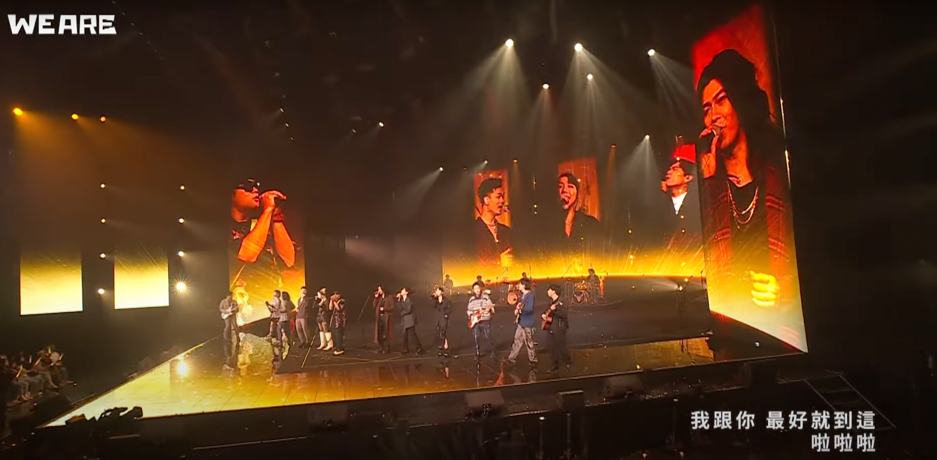
舞台陣形的多元運用
超過20種的陣形變化才能夠讓視覺可大可小。
Diverse Use of Stage Formations More than 20 types of formation changes to make the visuals scalable.
節目視覺主題的風格統一
從去年到今年 ,在節目設計上的主題一直都有明確分類,為了讓主題的區分更為明顯,我們的視覺也需在各part 提供差異性。 好讓觀眾更能區分主題所傳達的意象。
Unified Style of the Program's Visual Theme From last year to this year, the themes of the program design have always been clearly categorized. To make the distinctions between themes more apparent, our visuals also need to provide differentiation in each part. This helps the audience to better distinguish the imagery conveyed by the themes.
貼服舞台及視覺的立體化
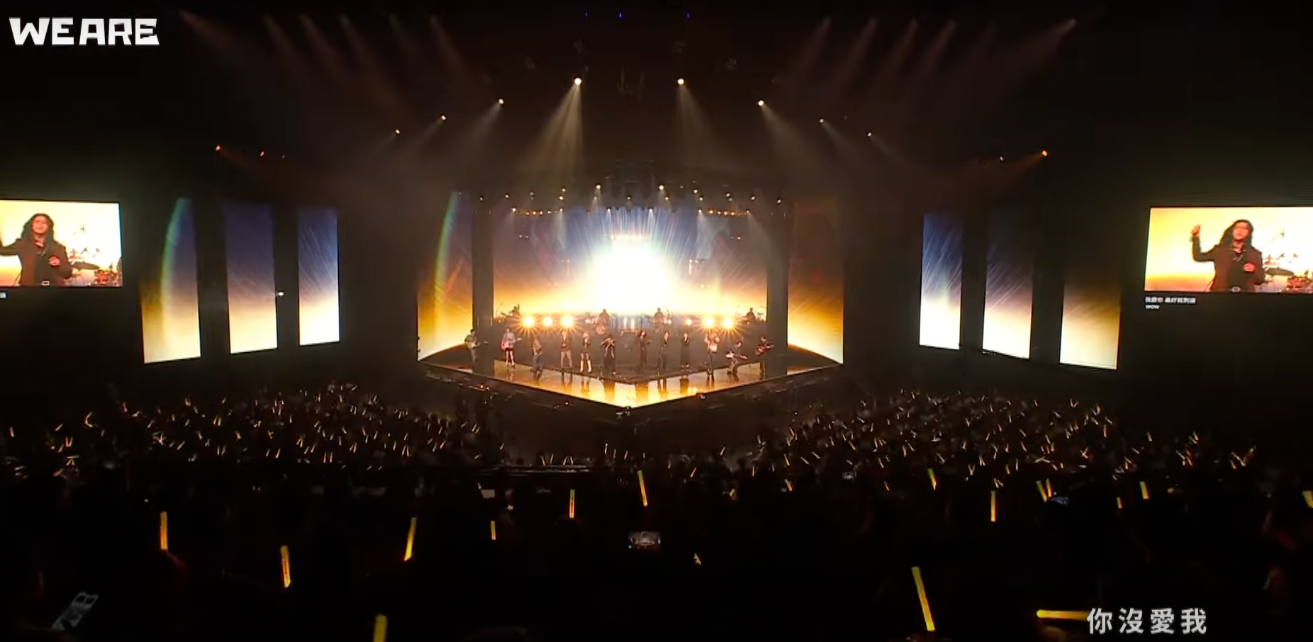
一直以來我們都希望舞台的框架能隱藏在視覺之中,讓觀眾能夠更沈浸的感受表演內容,所以無論是貼服舞台形狀本身的立體性或是使用局部舞台的隱匿性,目的都是讓舞台不被人一眼看穿,甚至無法預測舞台下一步的變化,創造舞台的莫測感。
Conformity to the Stage and Three-dimensional Visualization We have always hoped that the frame of the stage can be concealed within the visuals, allowing the audience to be more immersed in the content of the performance. Therefore, whether it is adhering to the three-dimensionality of the stage shape itself or using the hidden aspects of parts of the stage, the goal is to prevent the stage from being easily seen through, or even to predict the next change of the stage, creating a sense of unpredictability for the stage.
We Are Style 玖壹壹 911 / HRC Kids/ 蘇慧倫 Tarcy Su
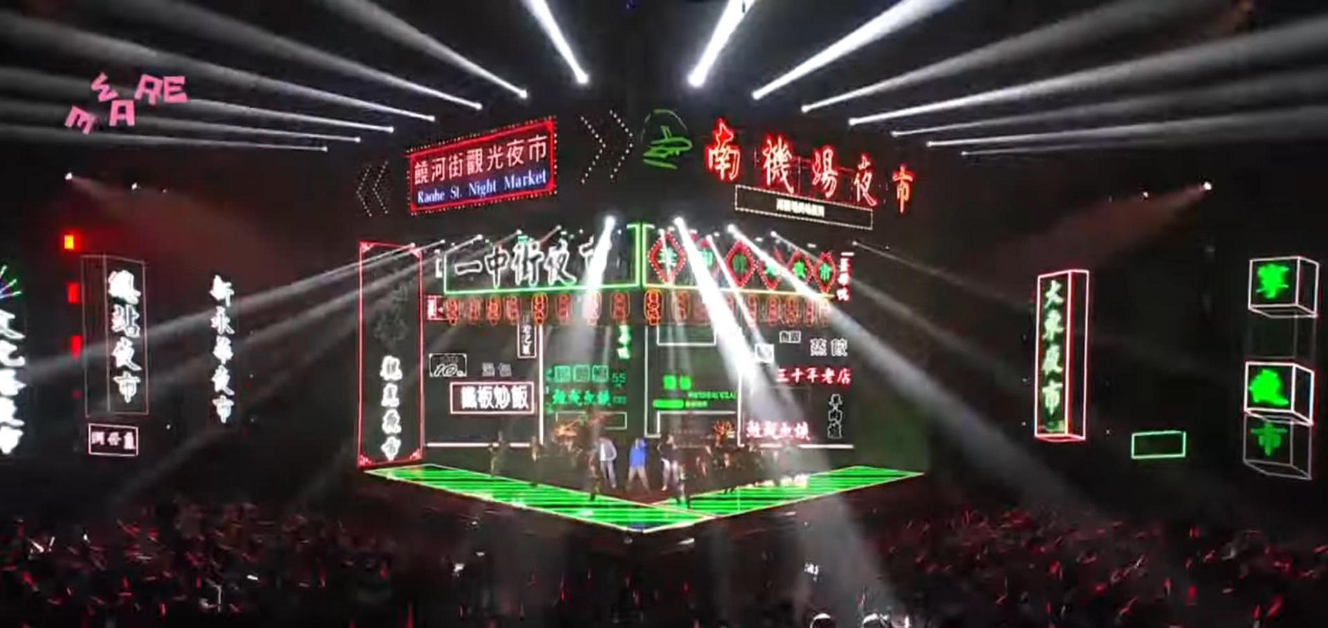
以台灣夜市文化出發 、象徵家家團聚的四合院霓虹場景,充分展現台式的搖滾氣勢,展現台灣本土文化與現代樂團的完美結合,開啟一個希望、喜悅與團聚的新年。
Starting from the culture of Taiwanese night markets and using the neon scenes of traditional Siheyuan, which symbolize family reunions, to fully display the Taiwanese-style rock spirit. This showcases the perfect combination of Taiwan's local culture and modern bands, ushering in a New Year filled with hope, joy, and reunion.
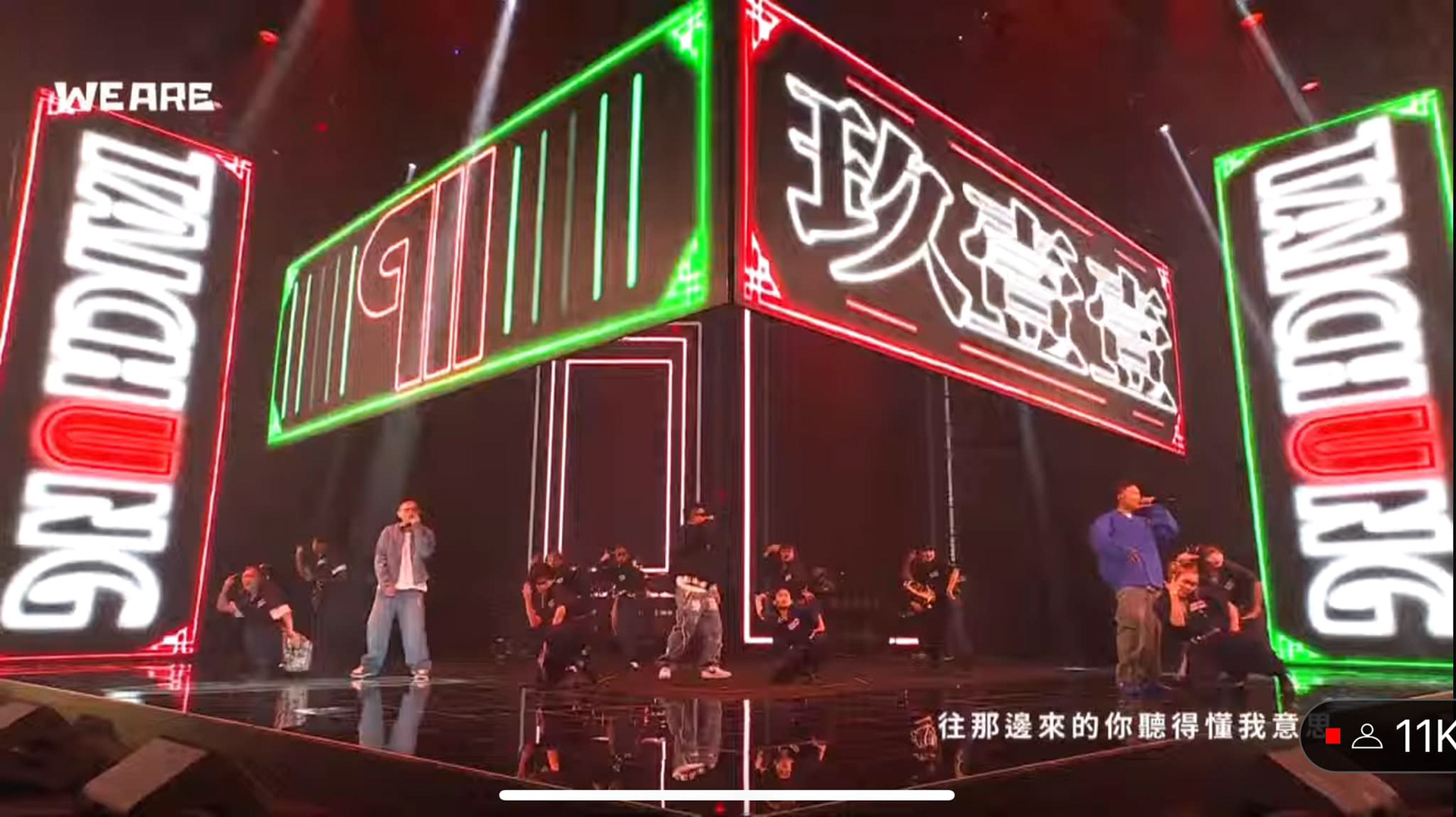
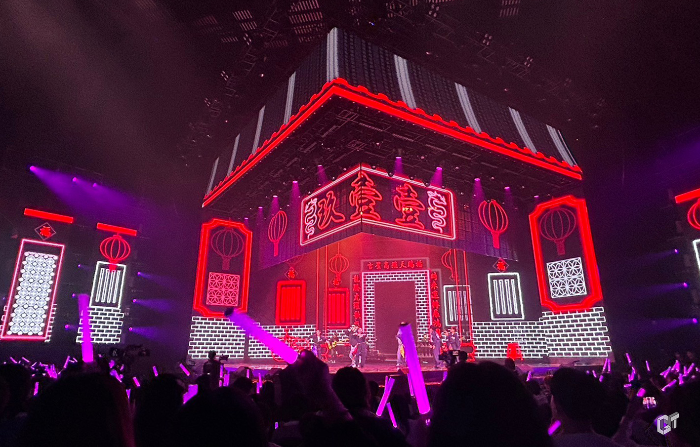
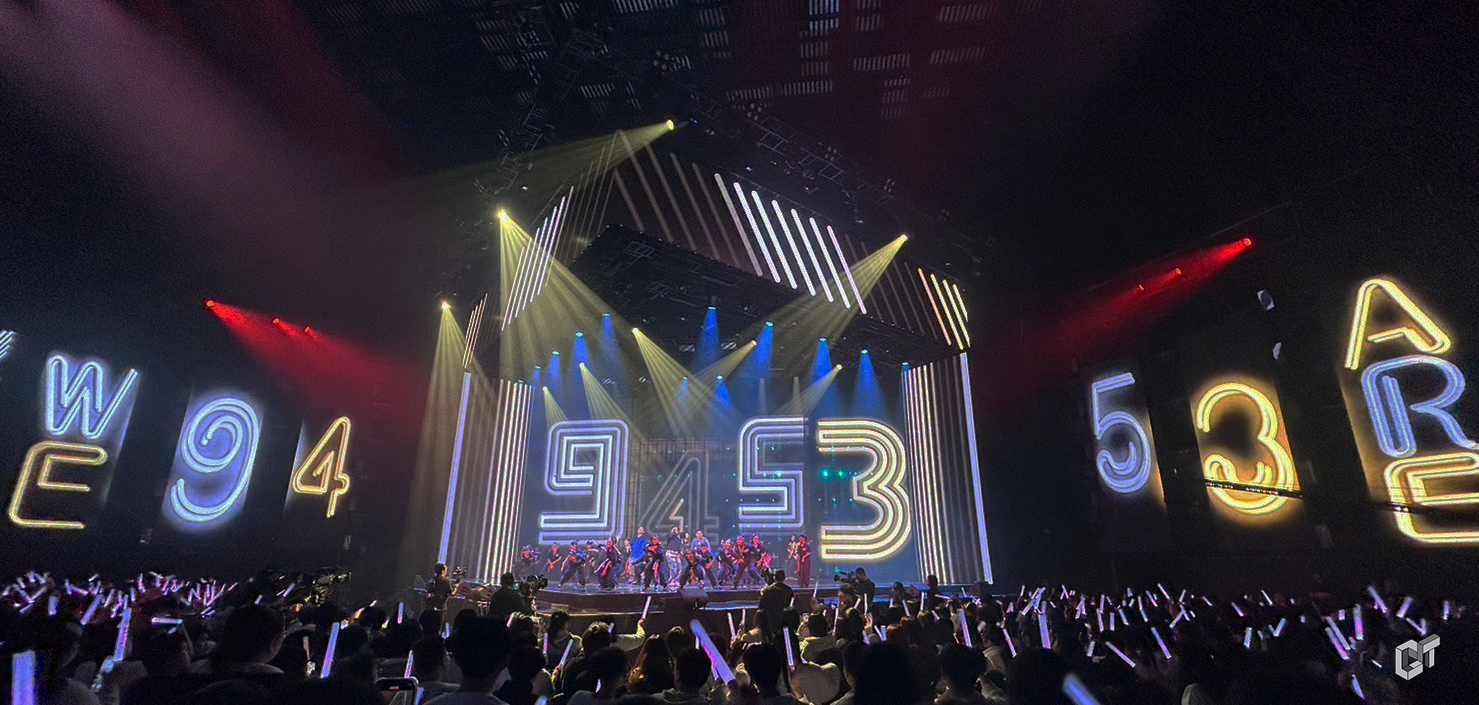
玖壹壹與蘇慧倫的共演內容以具象的黃色月亮主體搭配特殊格柵場景,展現搖滾的澎湃氣勢.
The joint performance of 911 and Tarcy Su features a vivid yellow moon theme paired with a unique grid scene, showcasing the surging spirit of rock.
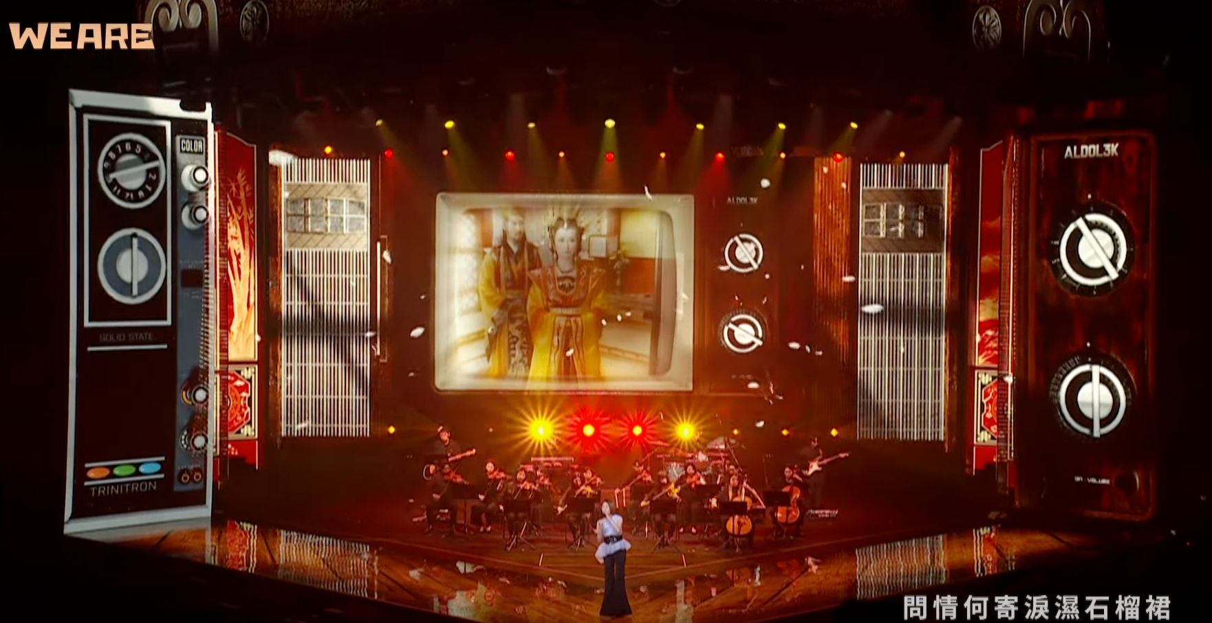
We Are Memories 李翊君/孫盛希/洪佩瑜
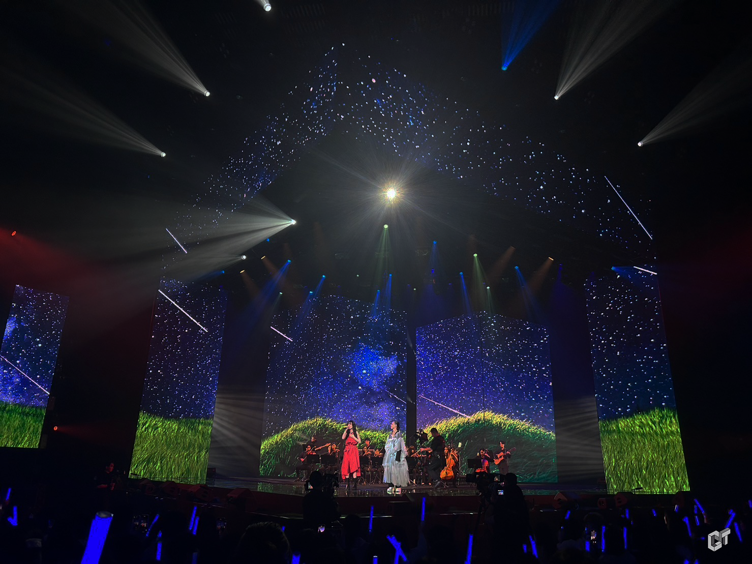
西元2000年以前的台劇主題曲,由知名歌手李翊君演繹瓊瑤經典臺劇的歌曲,講述了一個時代的故事。這次我們將觀眾帶回那個被復古電視框住的年代。舞台上,一台巨大的台式復古電視靜靜地矗立,成為視覺的中心。
Renowned singer Li Yijun performs songs from Qiong Yao's classic Taiwanese dramas, telling the story of an era. This time, we take the audience back to the era framed by retro televisions. On stage, a giant Taiwanese-style retro TV stands quietly, becoming the center of visual attention
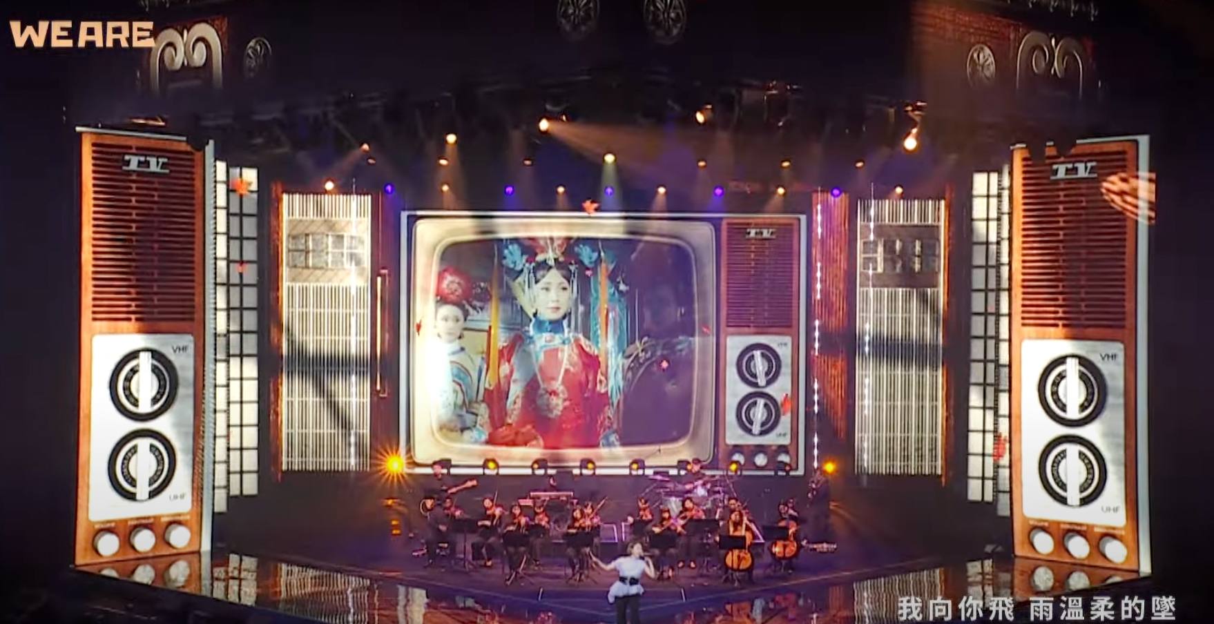
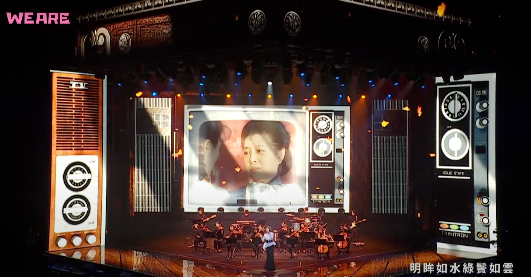
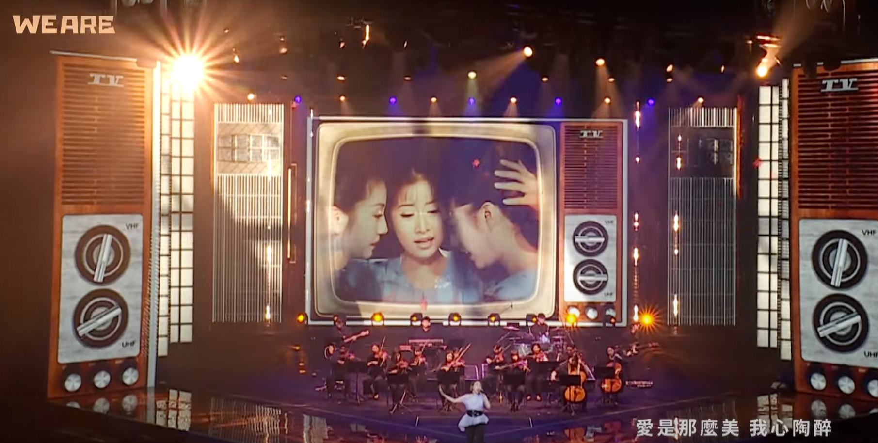
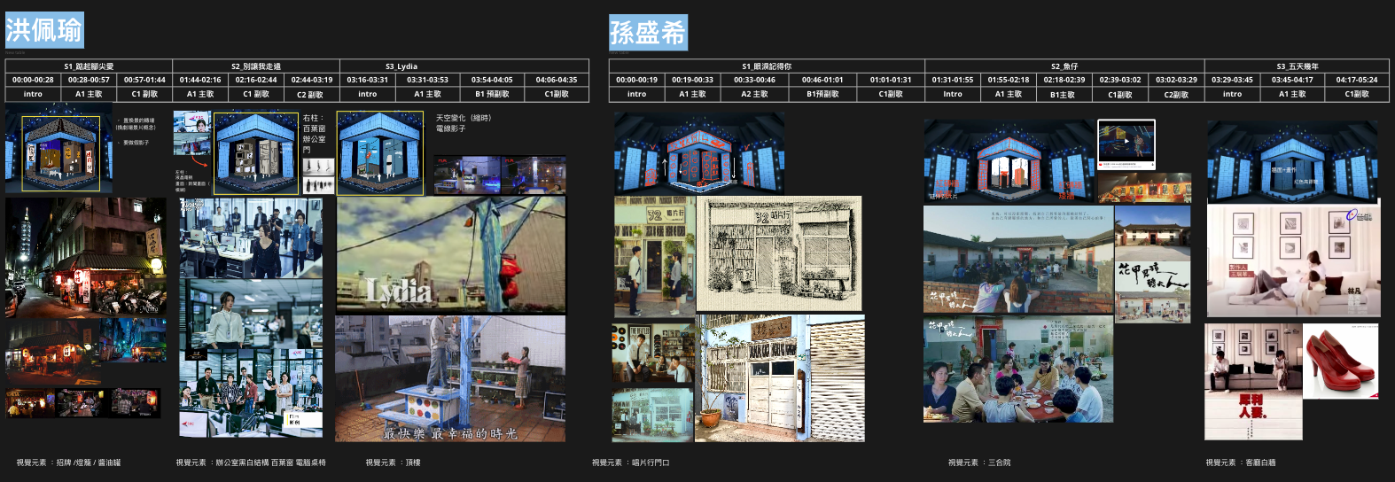
2000年後台劇組曲復刻的台劇場景,前奏一下,回憶湧上心頭。在柱狀的在設計中保有原始場景,需要有透視的設計,帶給觀眾回到劇中的既視感.
With the medley of Taiwanese dramas post-2000s, the scenes are reenacted, and as the prelude plays, memories flood back. The columnar design retains the original scenes, requiring a perspective design to give the audience a sense of déjà vu, as if returning to the drama itself.
設計手稿 Hand Scripts
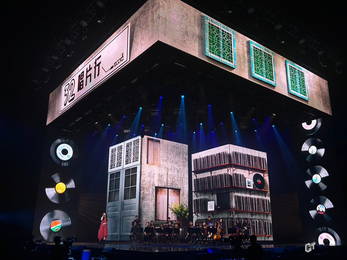
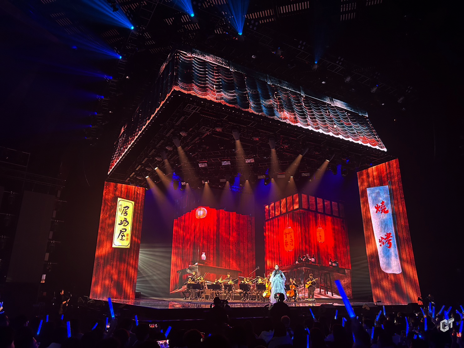
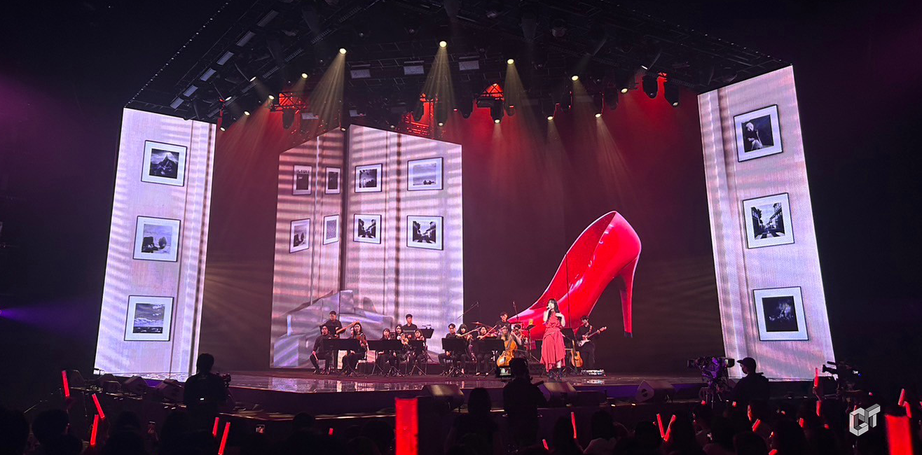
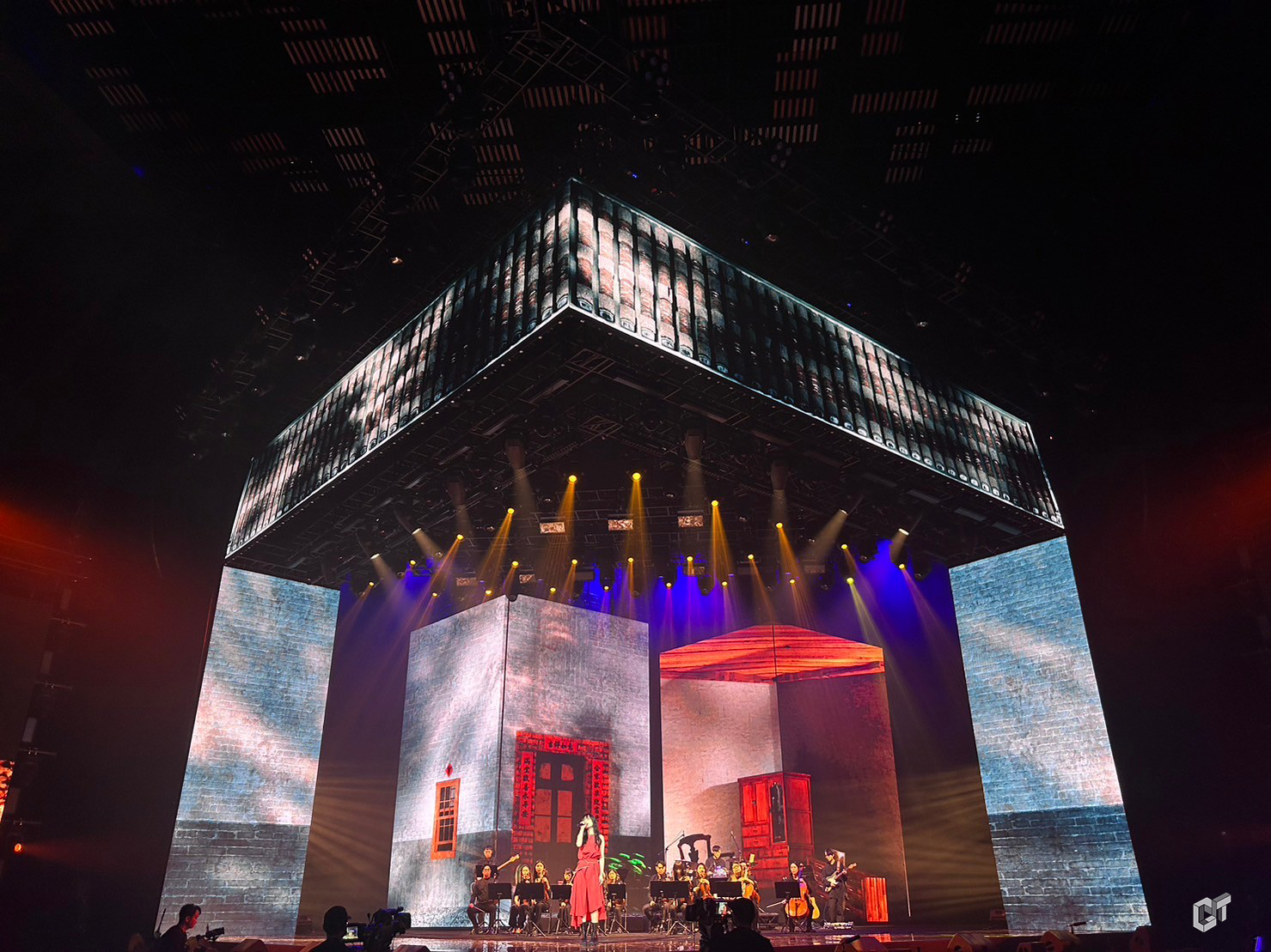
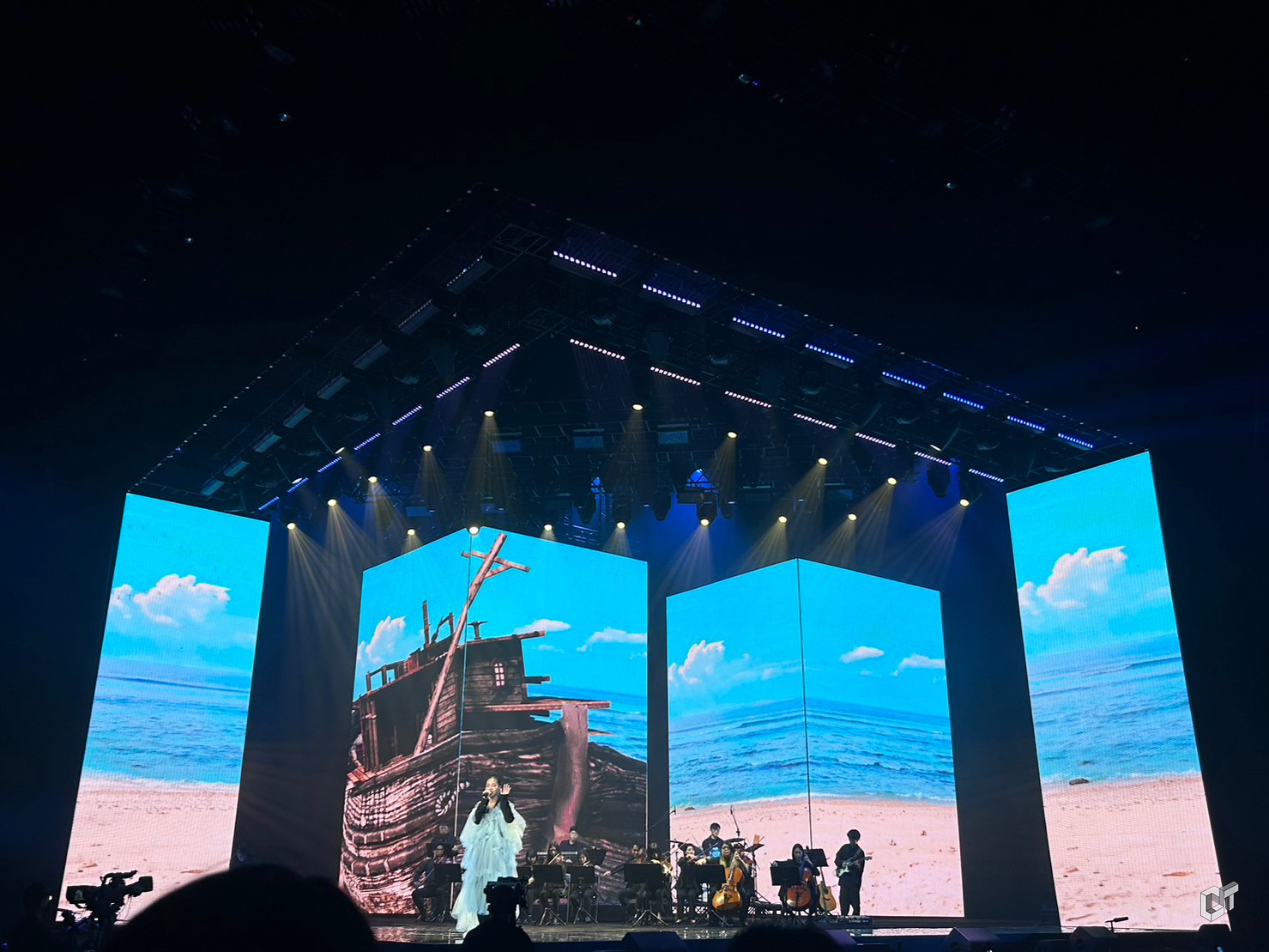
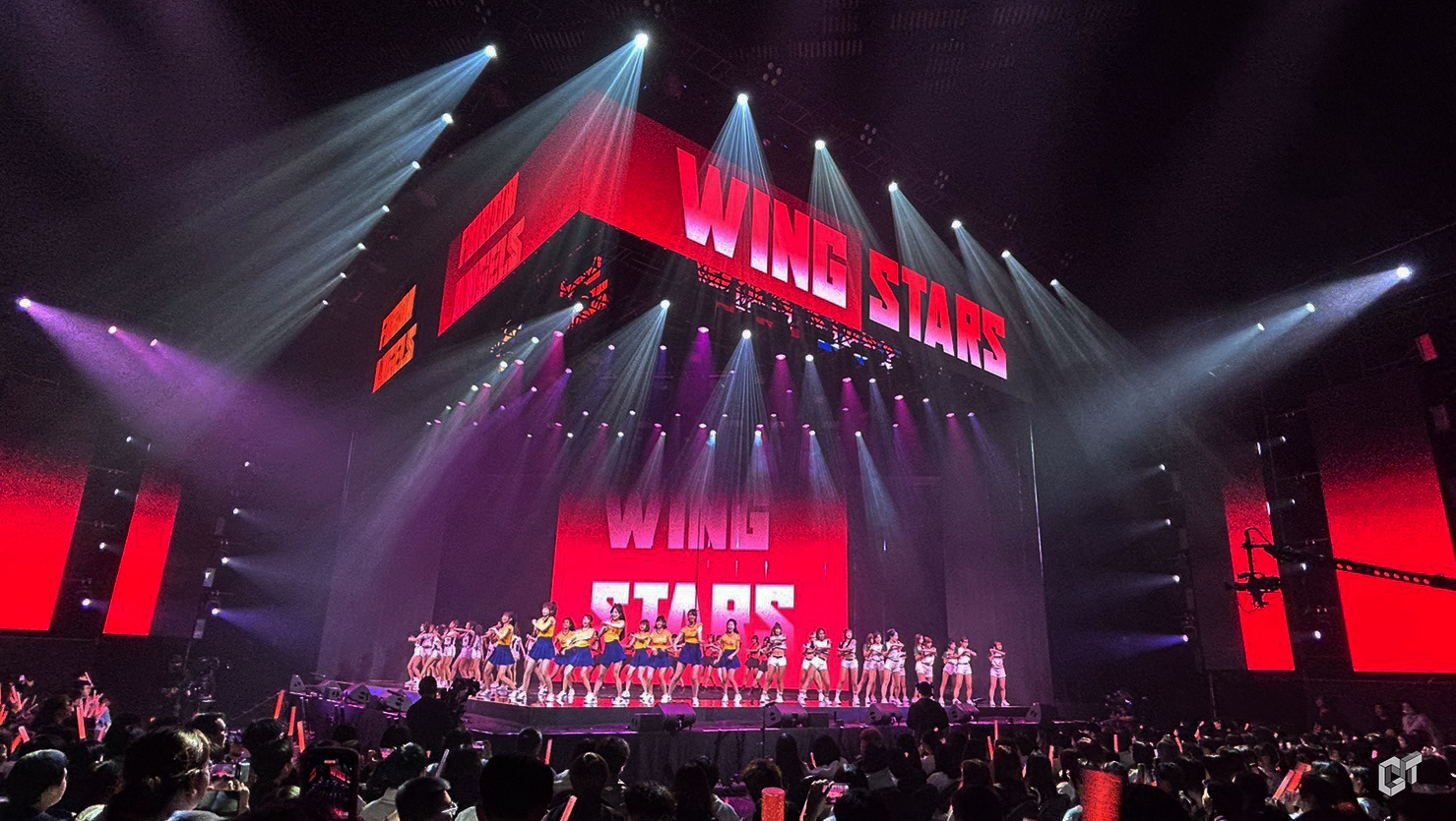
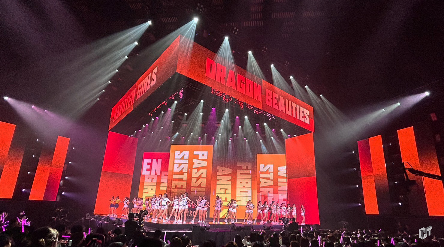
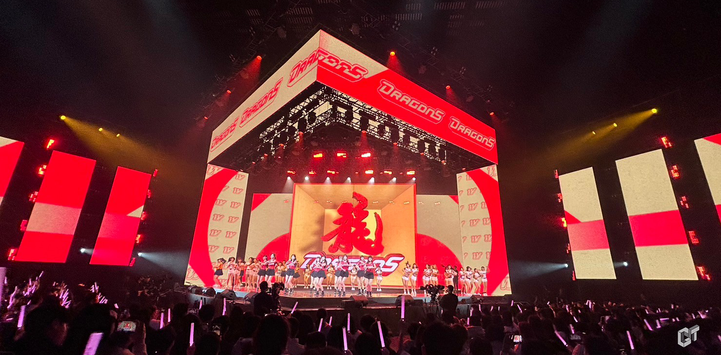
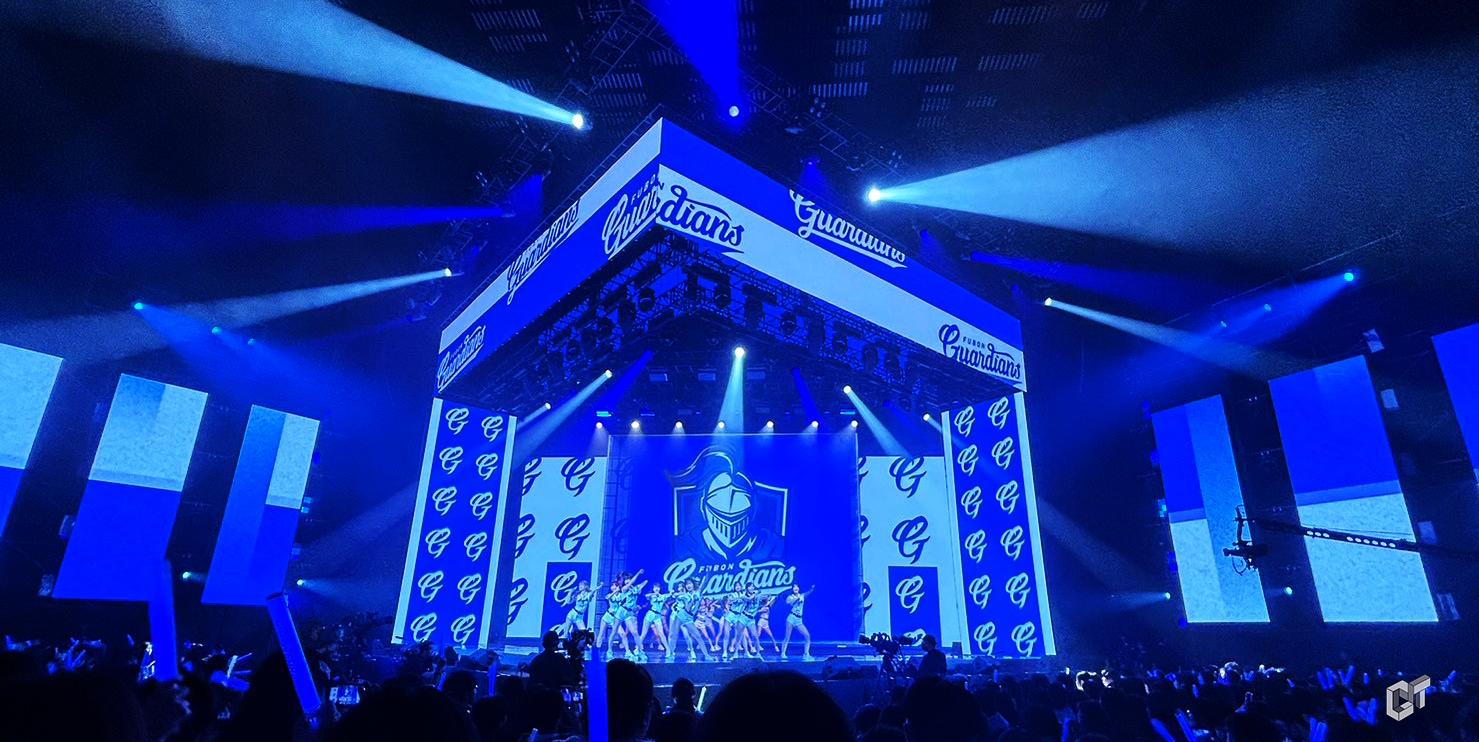
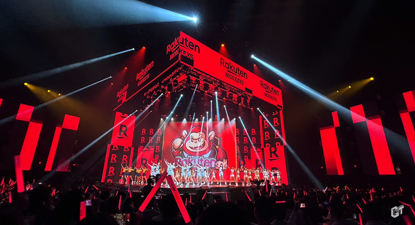
We Are Together 中職+啦啦隊
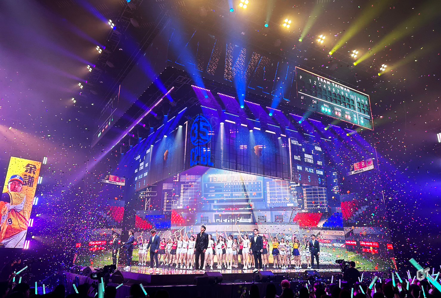
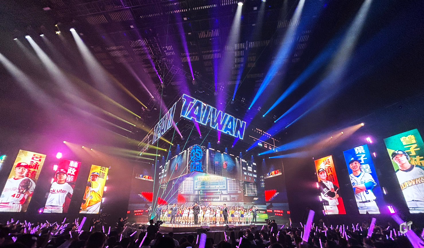
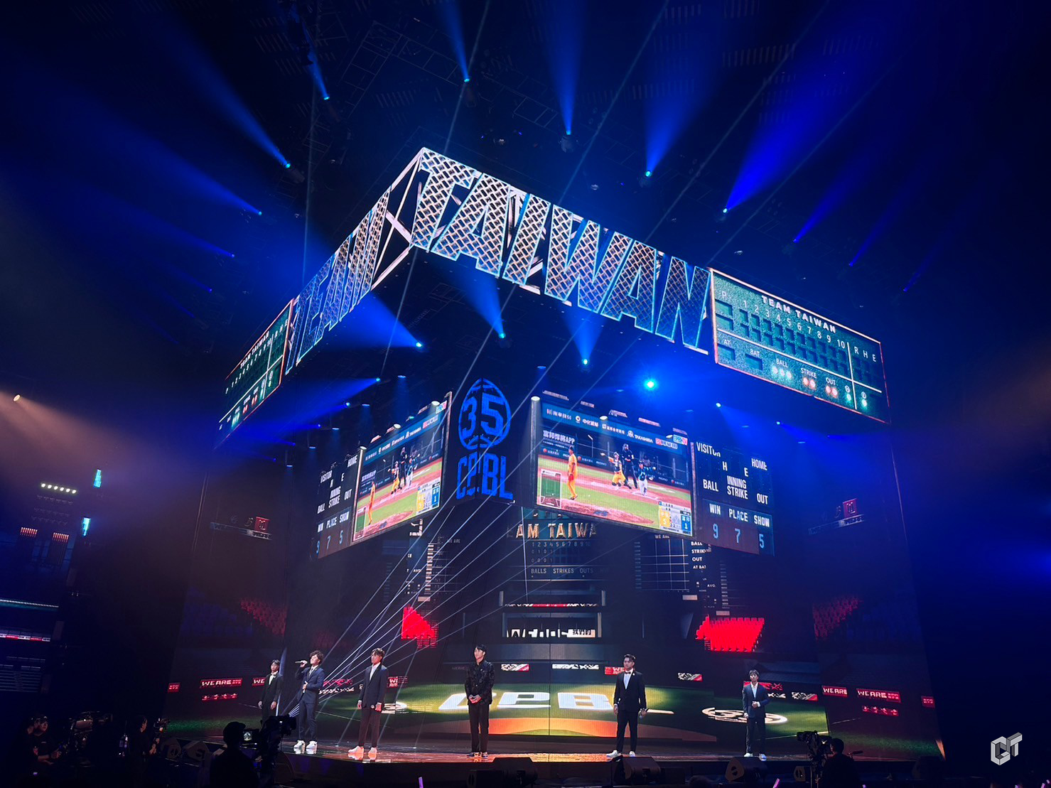
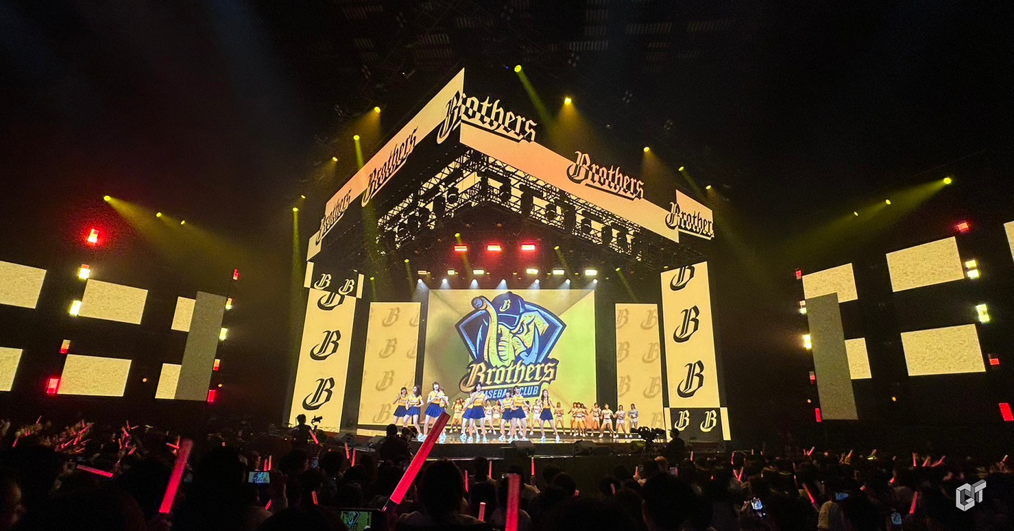
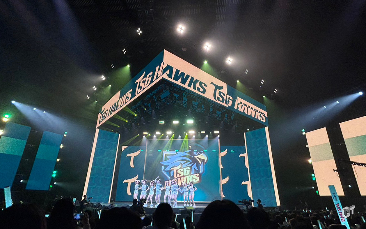
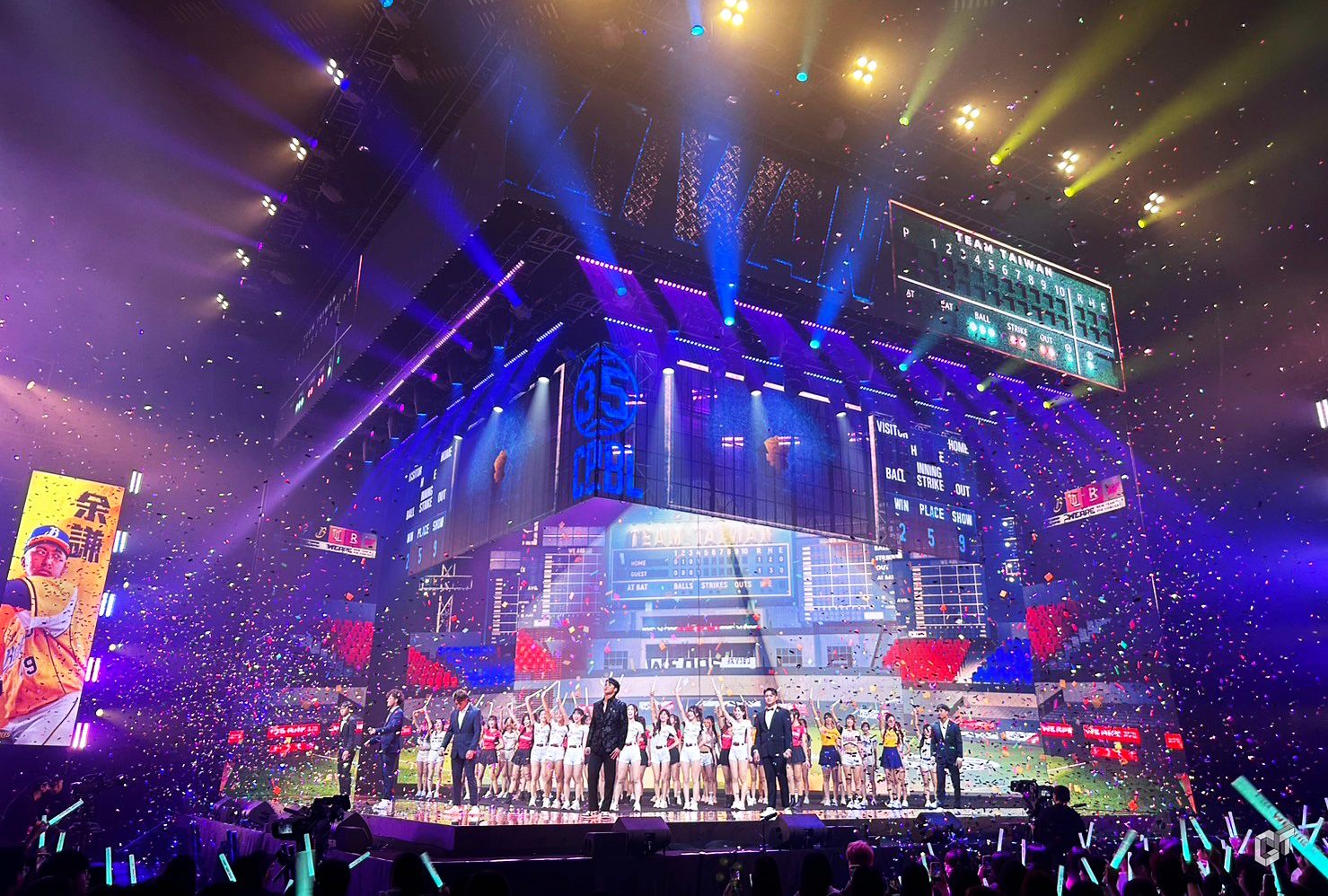
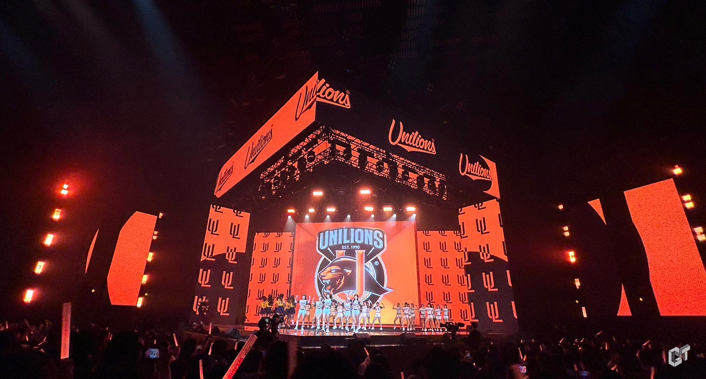
中華職棒是台灣的驕傲,旨在重現中華職棒棒球場的舞台場景,也將活潑有活力的啦啦隊以層層堆疊的舞台打造立體彩色的舞台姿態。
The Chinese Professional Baseball League is Taiwan's pride, aimed at recreating the scenes of CPBL baseball fields. It also brings to life the lively and energetic cheerleading squads with a multi-layered stage, creating a vibrant and three-dimensional stage presence.
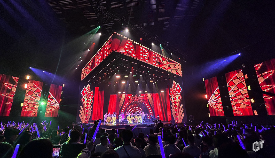
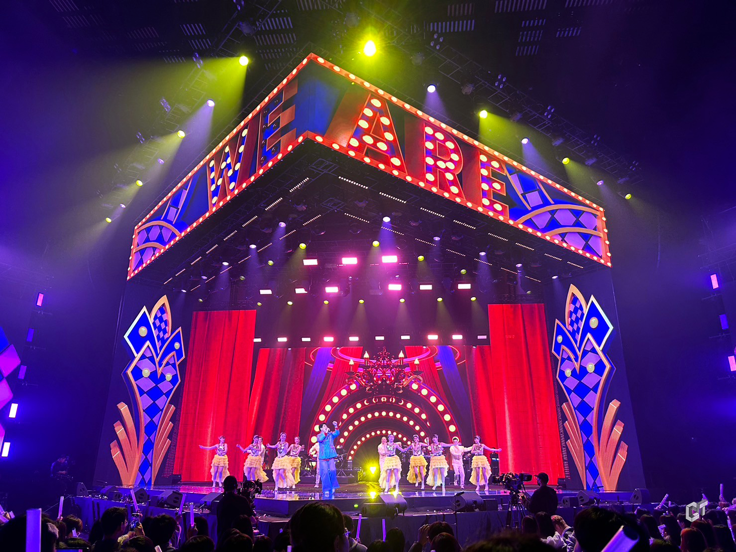
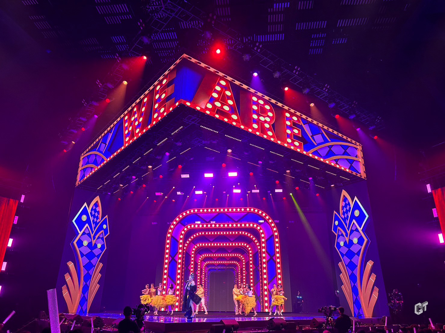
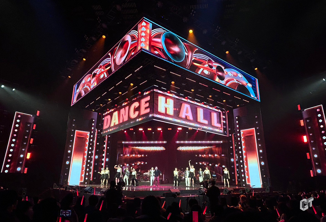
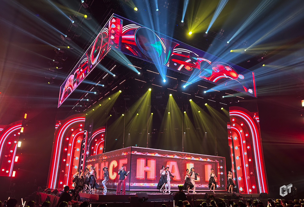
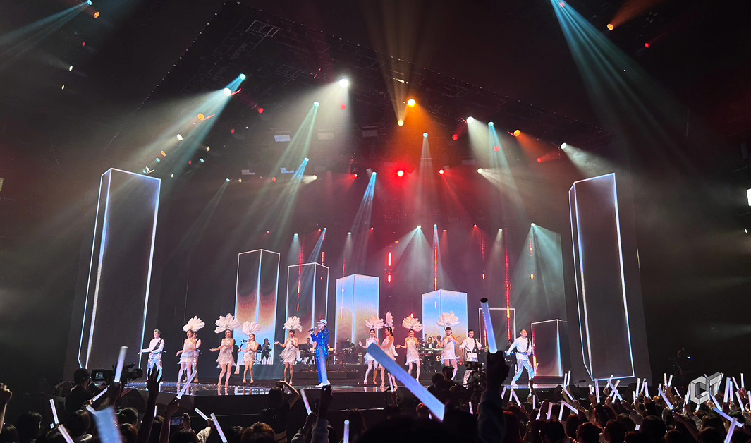
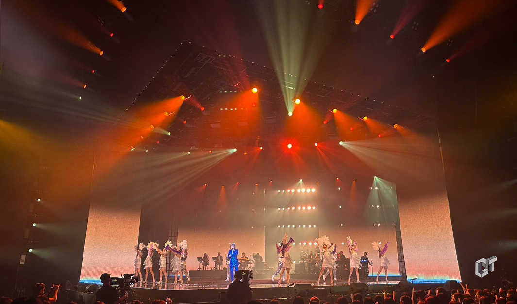
We Are Retro 經典歌廳秀 王彩樺 邵大倫 庭庭 葉璦菱 陳雷
重現台灣經典歌廳秀文化的面貌,歌舞主持樣樣都有,此段表演致力打造精緻華麗的場景 ,貼服舞台的造景彷彿回到輝煌的歌舞年代。
Recreating the look of Taiwan's classic cabaret show culture, featuring singing, dancing, and hosting, this performance is dedicated to creating an exquisite and splendid scene. The stage design closely adheres to the setting, as if returning to the glorious era of song and dance.
設計手稿 Hand Scripts

設計手稿 Hand Scripts

設計手稿 Hand Scripts

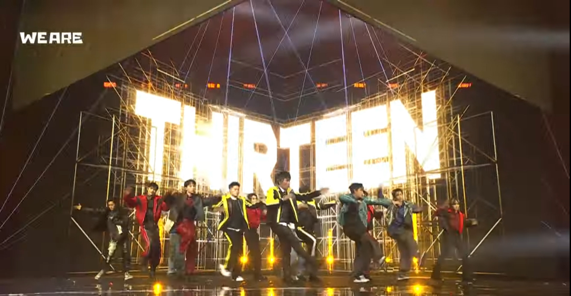
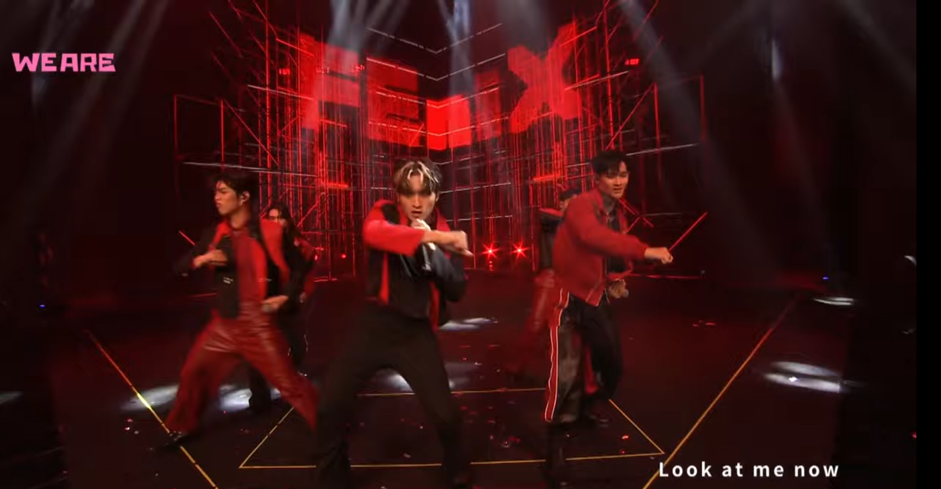
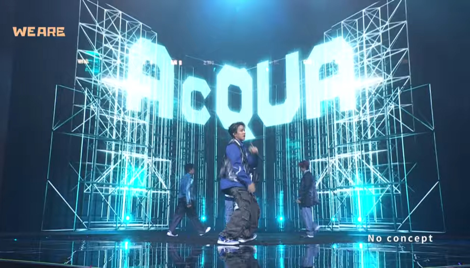
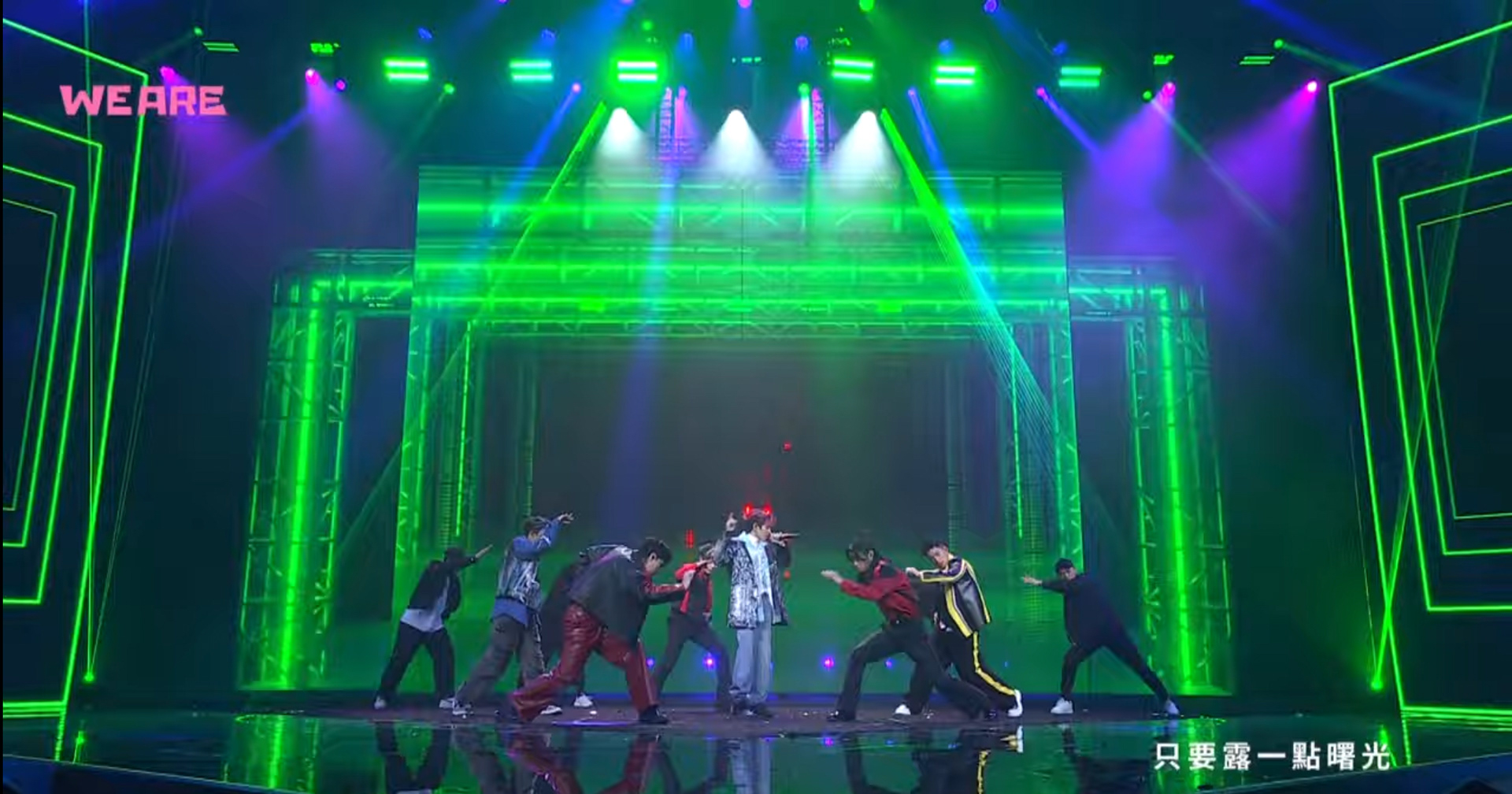
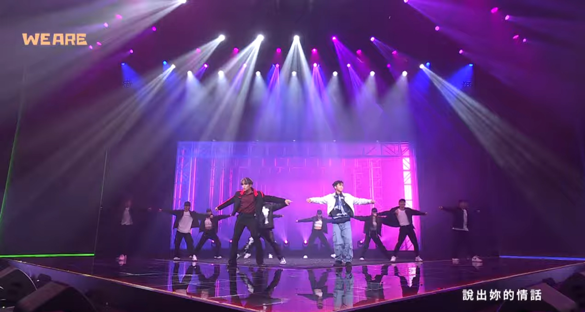
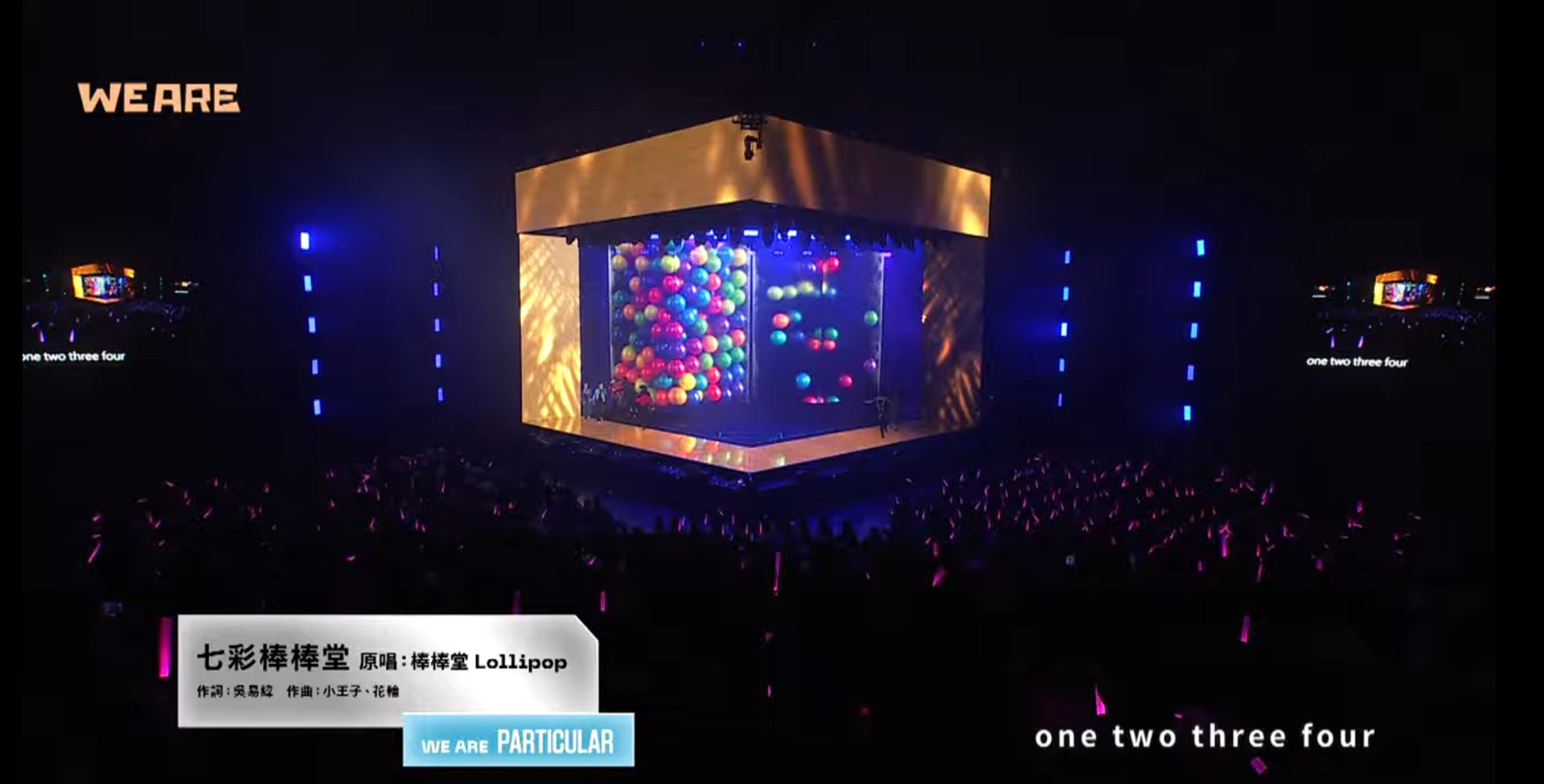
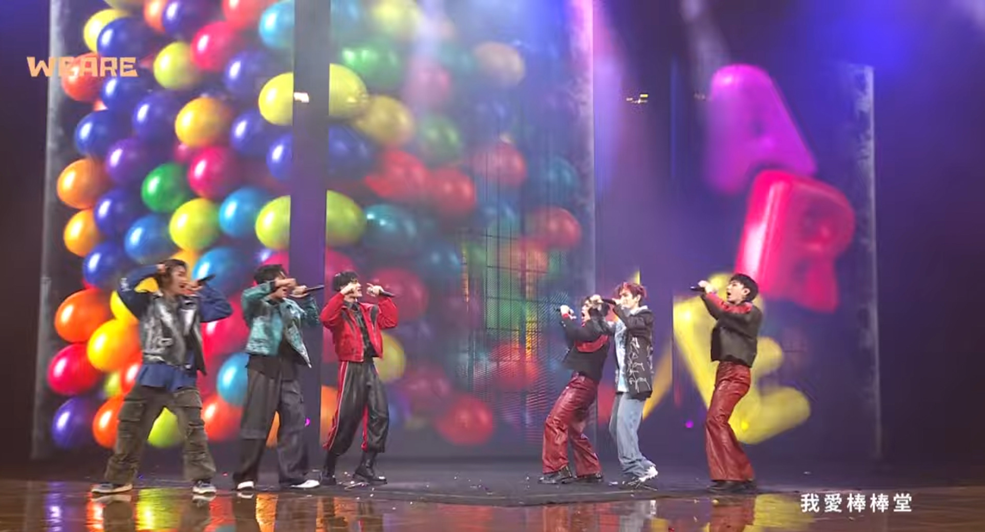
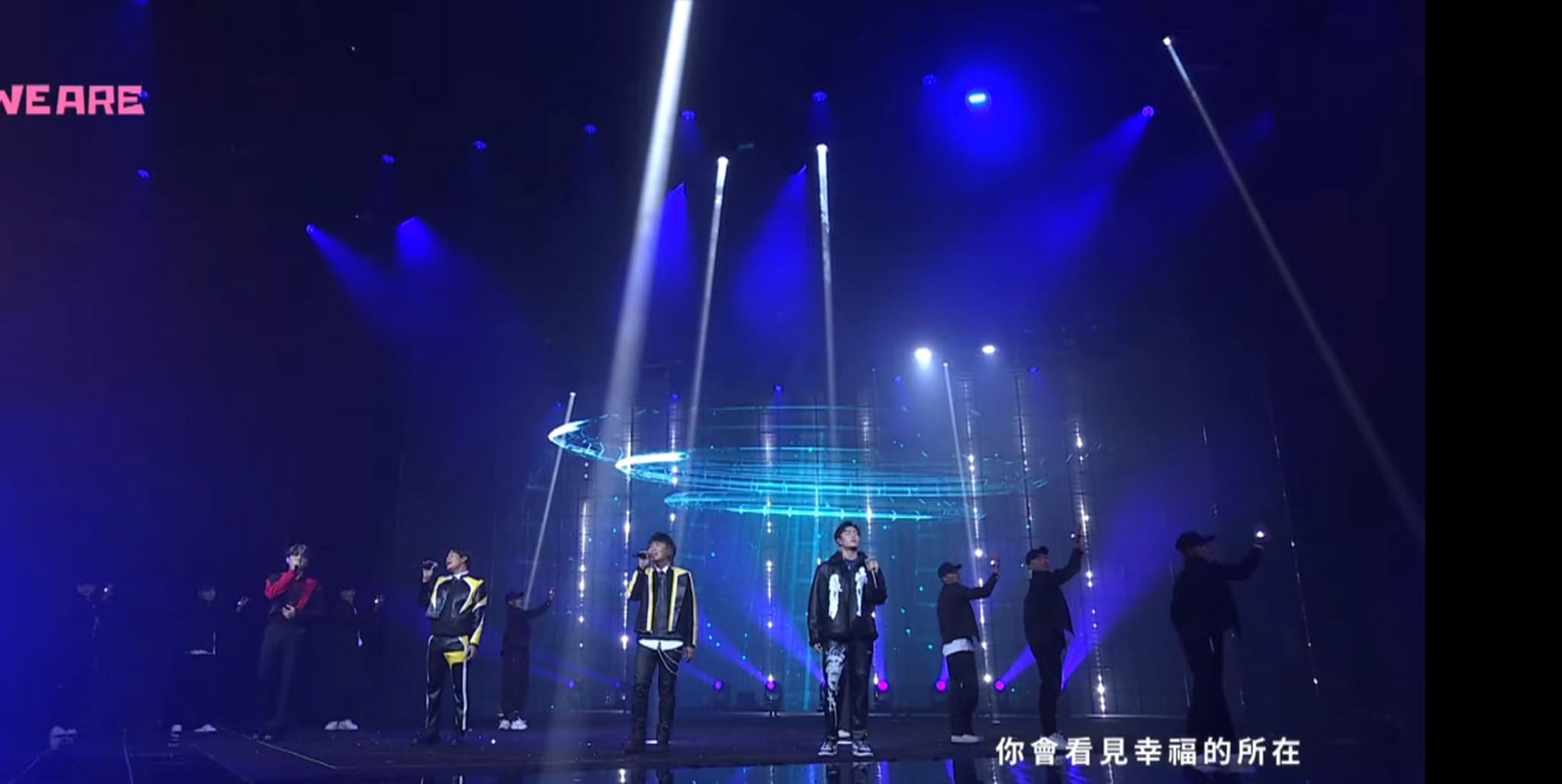
We are particular 限定男團 5566 /ACQua源少年 / FEnix
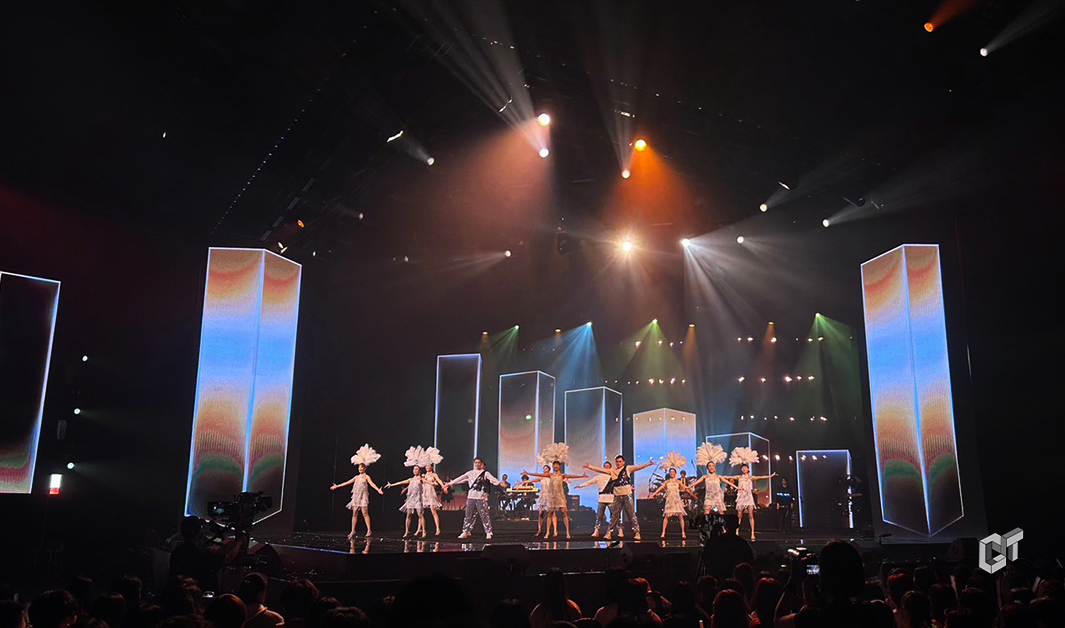
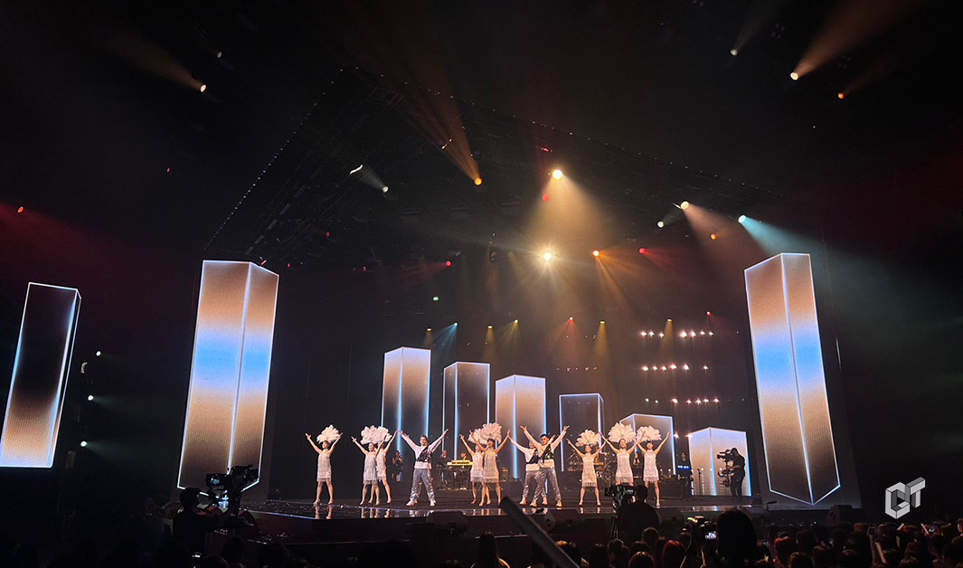
限定男團的驚喜組合,以台灣#男團偶像文化 句句熟悉的男團主打歌。憶起Taiwan Pop 的台流旋風,超過8種的陣型變化,讓男團們以舞蹈陣型結合舞台陣型的多重組合,讓觀眾沈浸在多變的演出,而不會看透舞台的全貌 。
The surprise combination of a limited boy band, featuring familiar hits from Taiwan's idol culture. Recalling the whirlwind of Taiwan Pop, with over 8 types of formation changes, allows the boy bands to integrate dance formations with stage arrangements in a multitude of combinations. This immerses the audience in a varied performance without revealing the full picture of the stage.
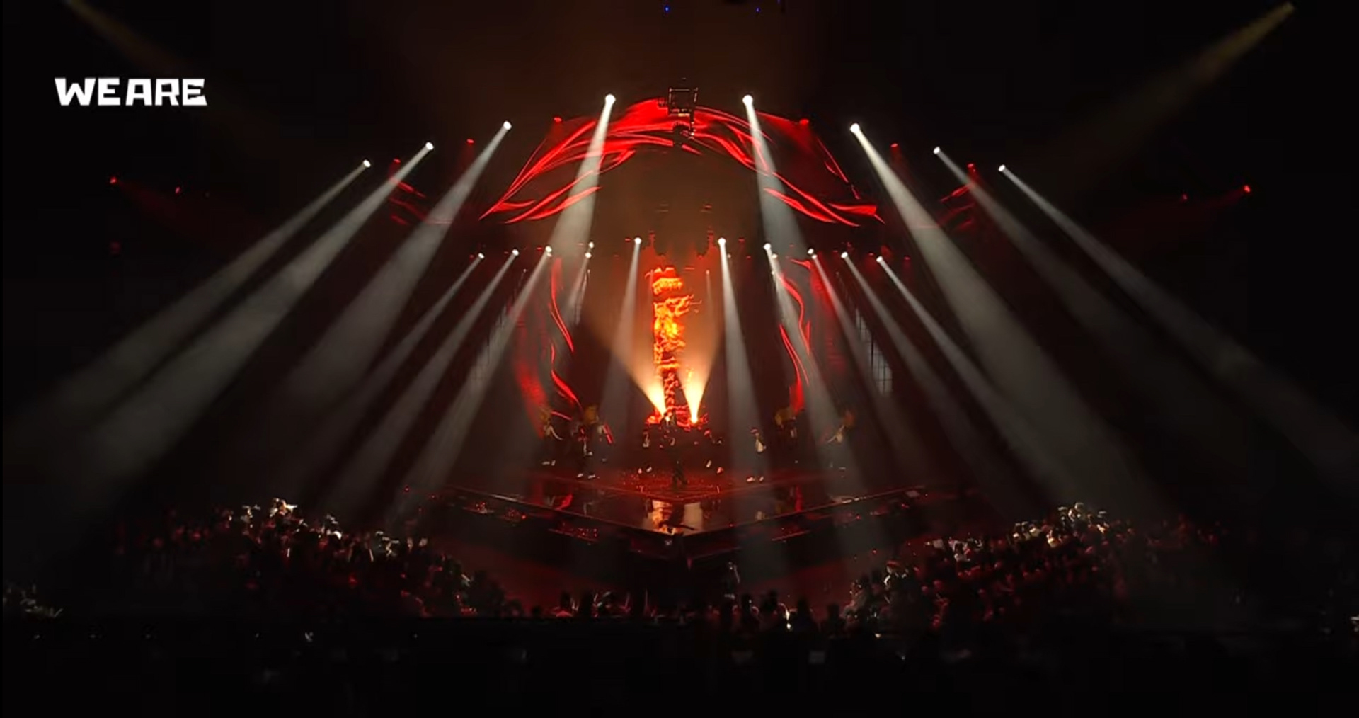
We are unlimited 台饒 Yappy 桃子 阿跨面 潮州土狗 小卡比 大支
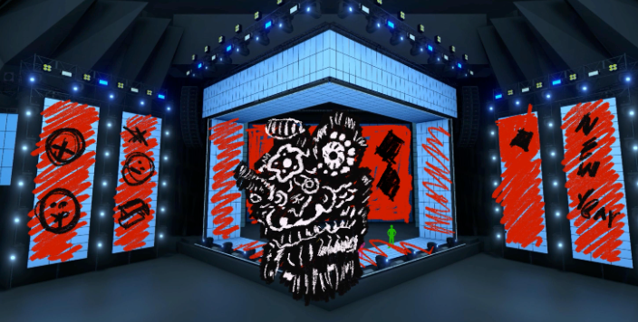
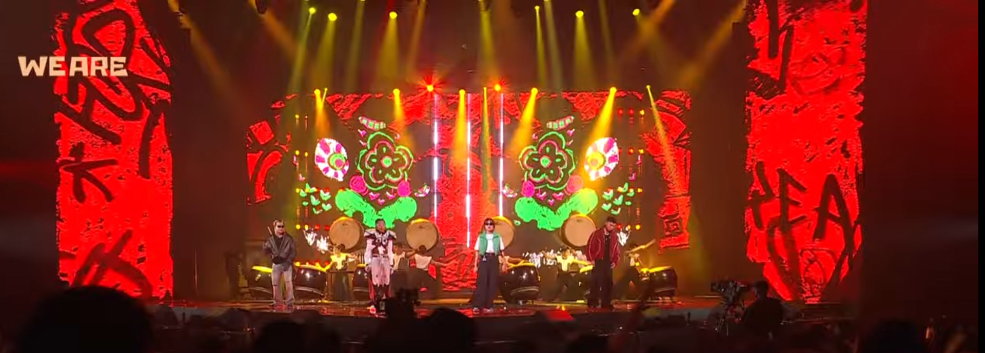
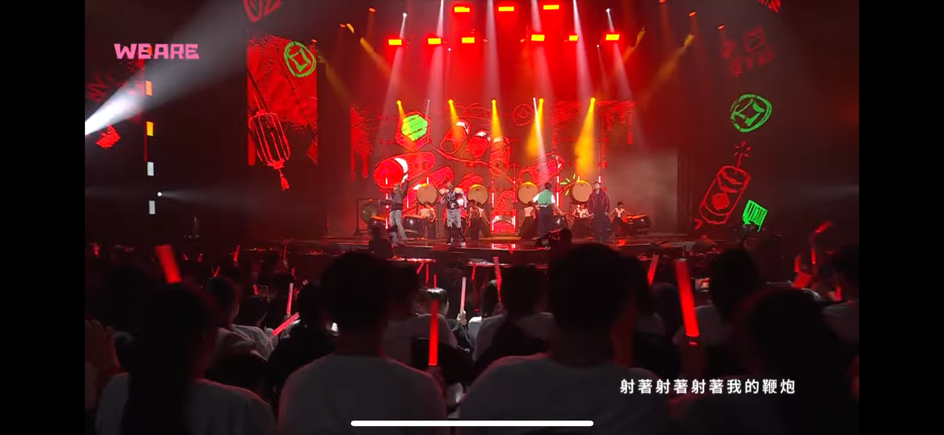
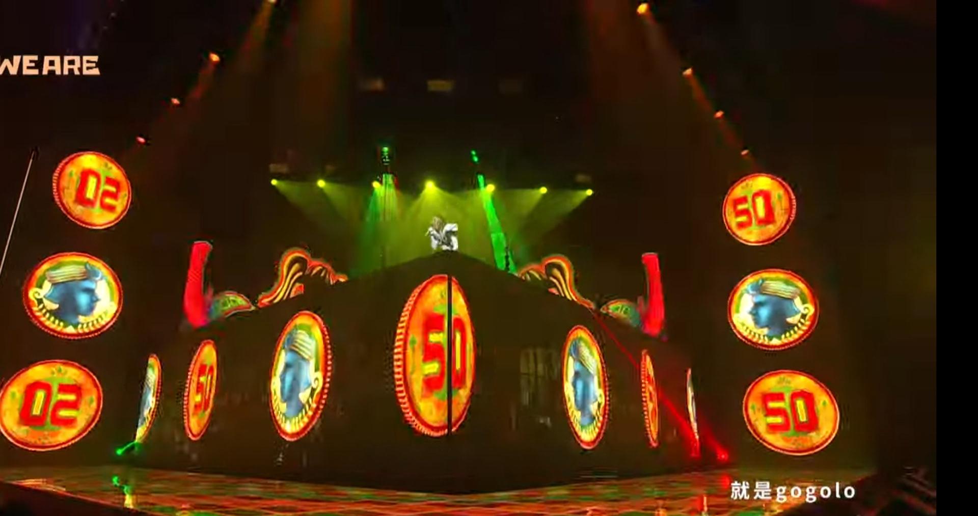
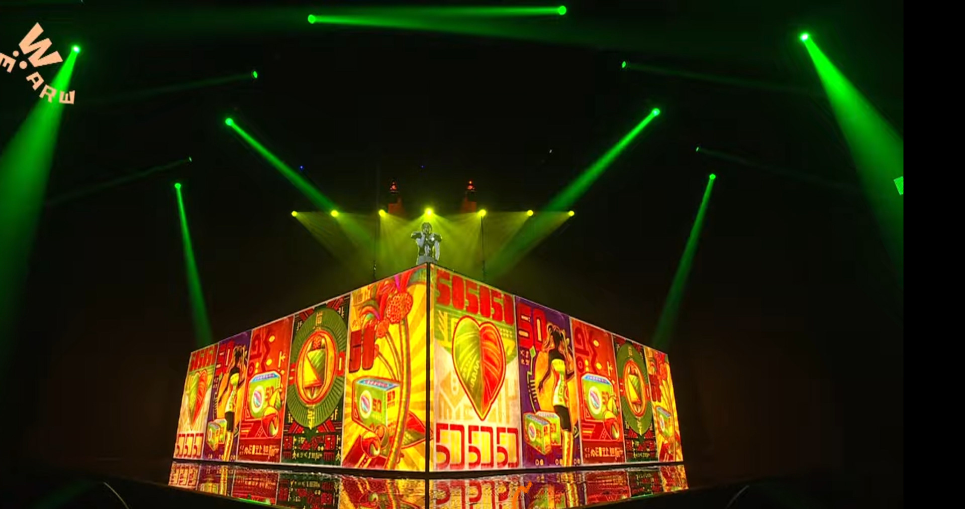
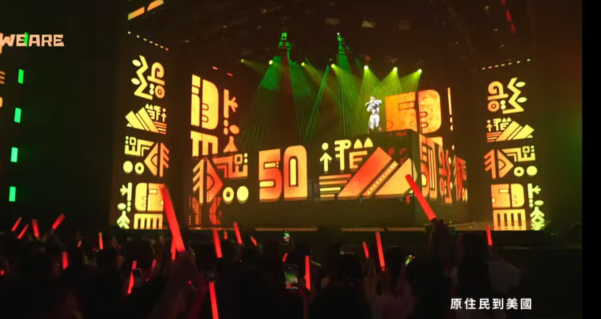
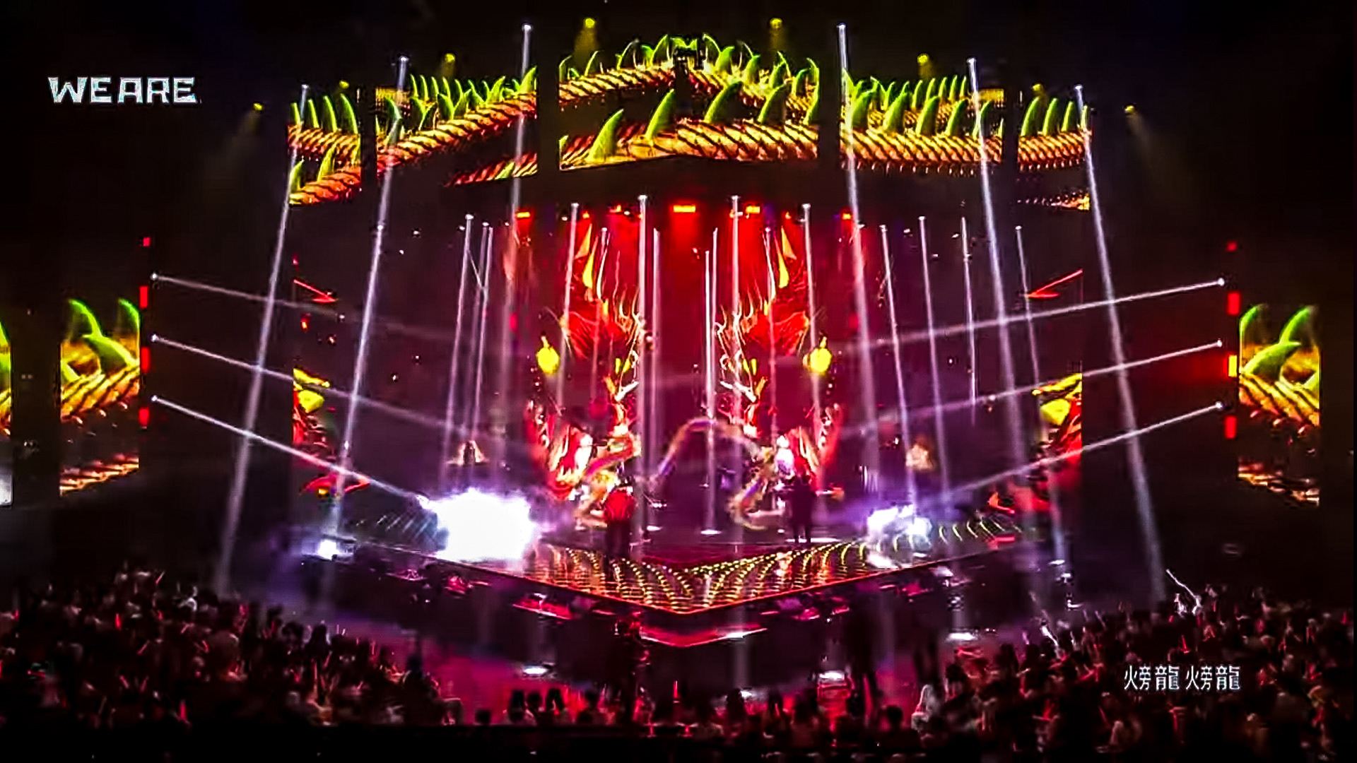
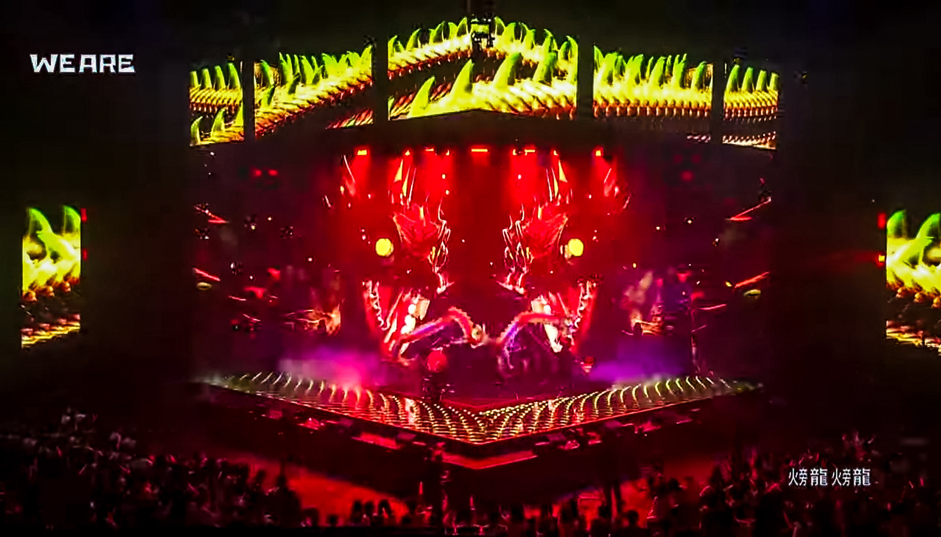
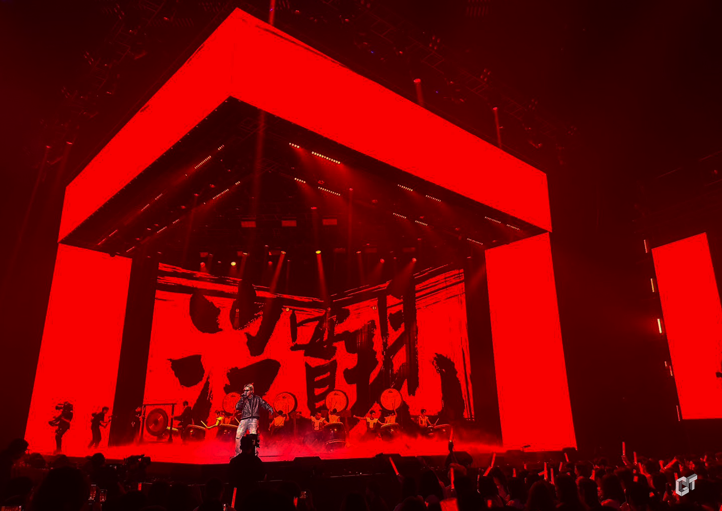
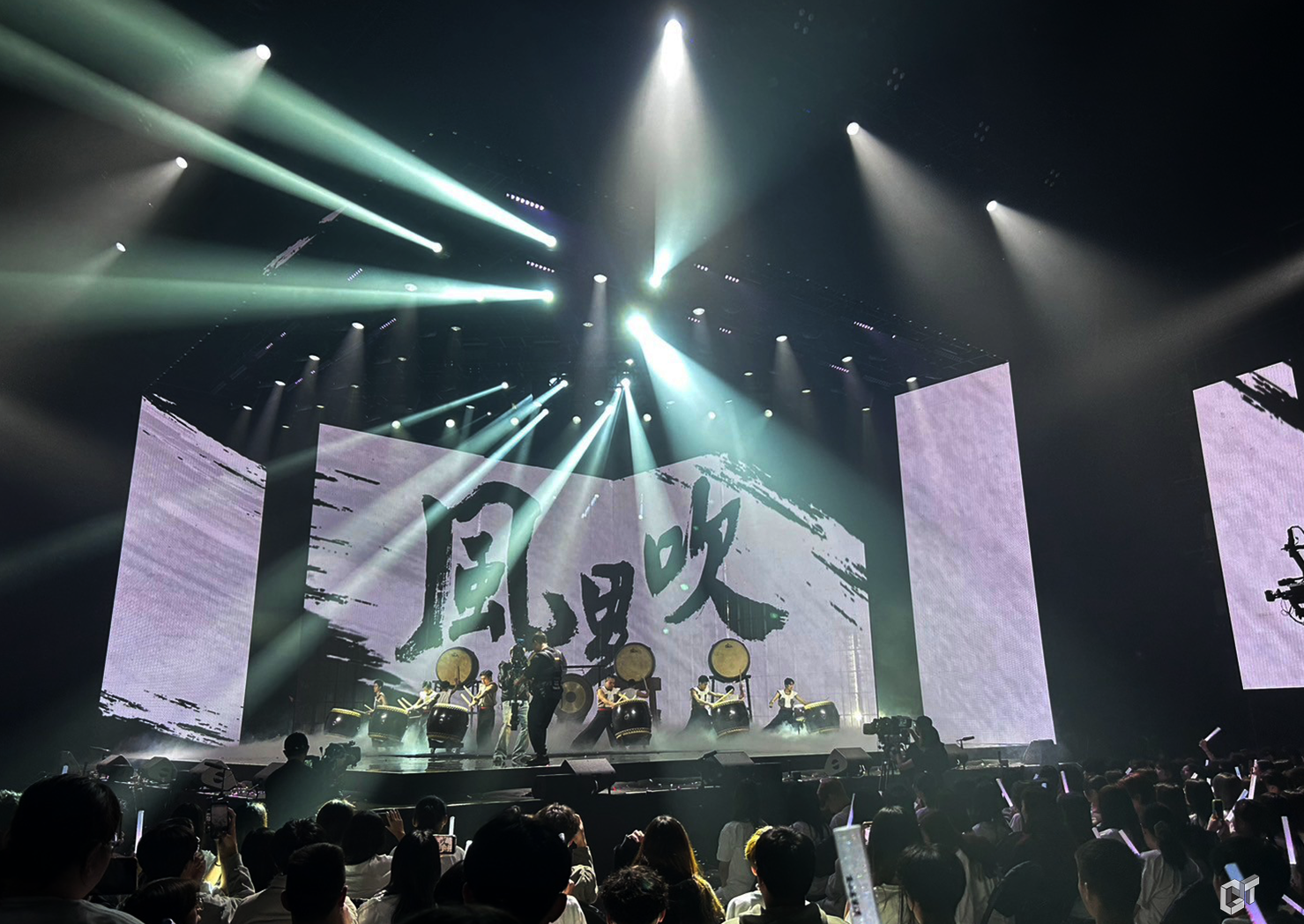
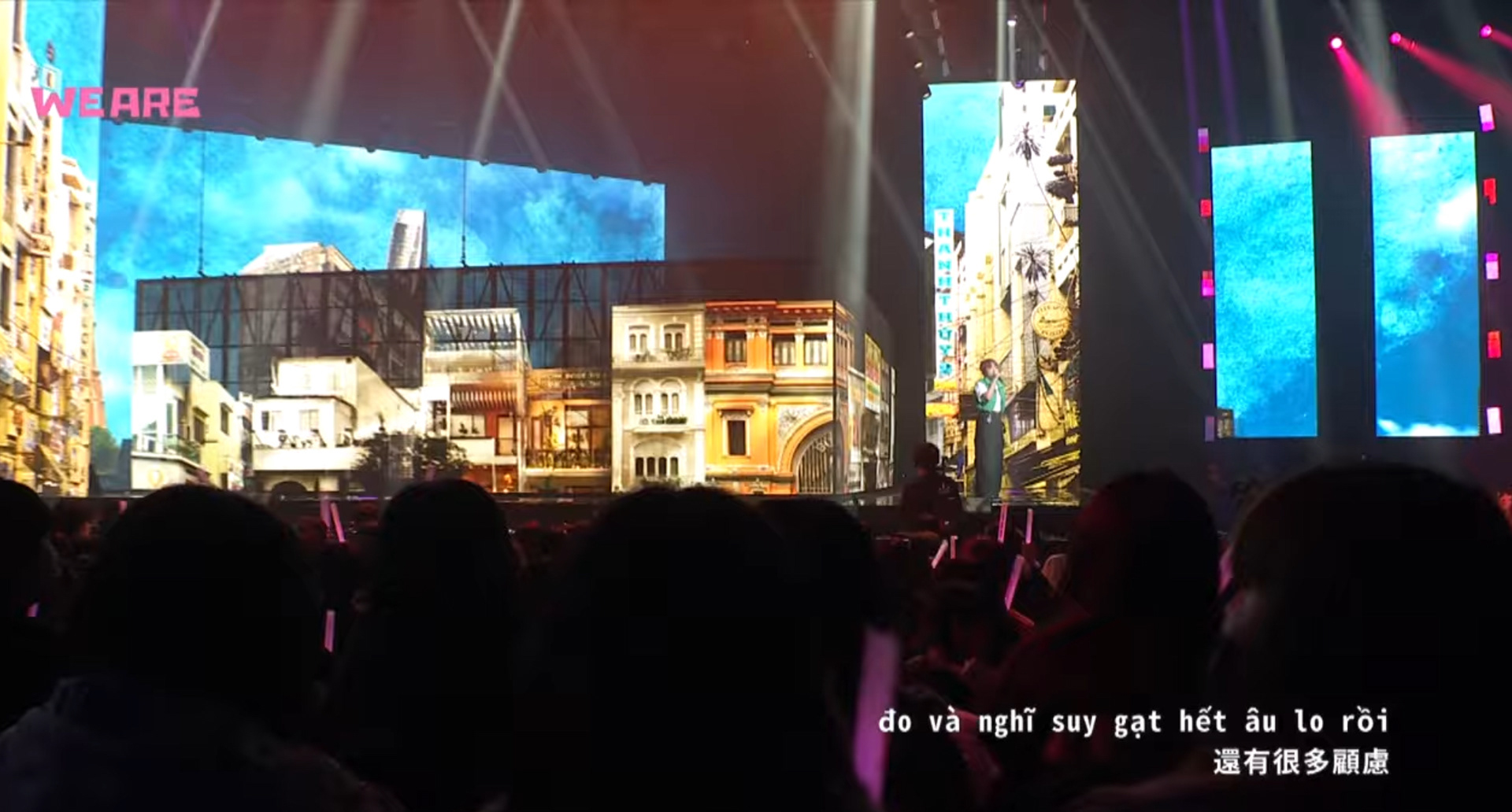
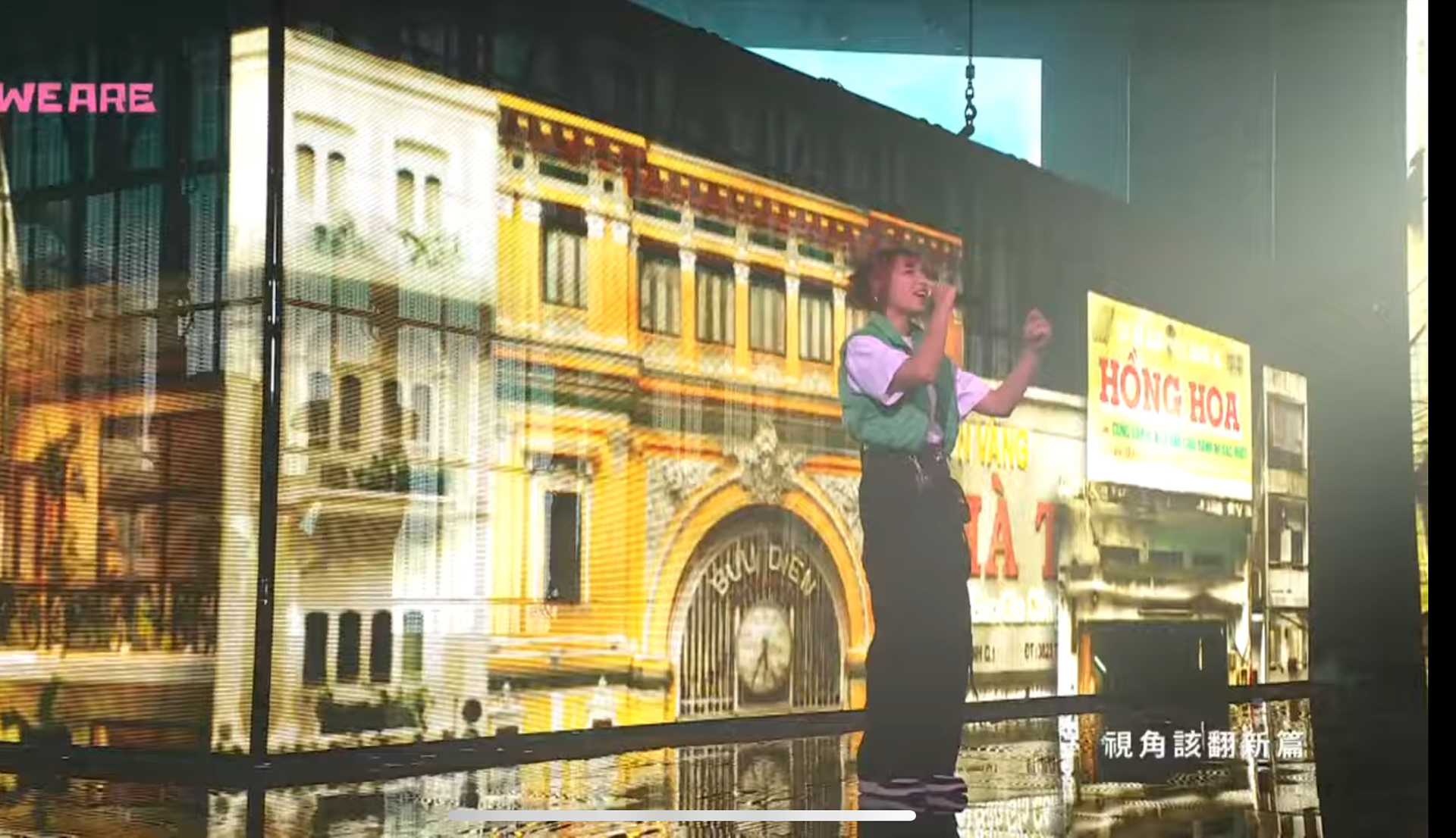
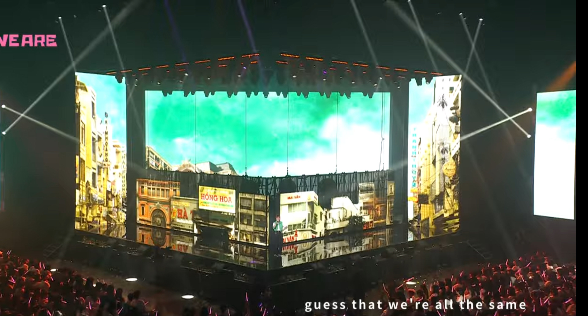
台饒文化度多元延展出 客家/閩南/越南/原住民族群的維度。也特別運用各族群的獨有符號,客家火旁龍、越南城市風光、原住民圖騰及色調插畫,打造專屬的文化場景。也與排灣族藝術家磊勒丹.巴瓦瓦隆以及書法家林佳穎合作打造屬於這個世代的台饒舞台。
The diverse extension of Taiwan's rap culture encompasses dimensions of Hakka, Minnan, Vietnamese, and Indigenous ethnic groups. It also specifically utilizes unique symbols from each ethnic group, such as Hakka fire dragon lanterns, Vietnamese cityscapes, and Indigenous totem colors, to create exclusive cultural scenes.
設計手稿 Hand Scripts
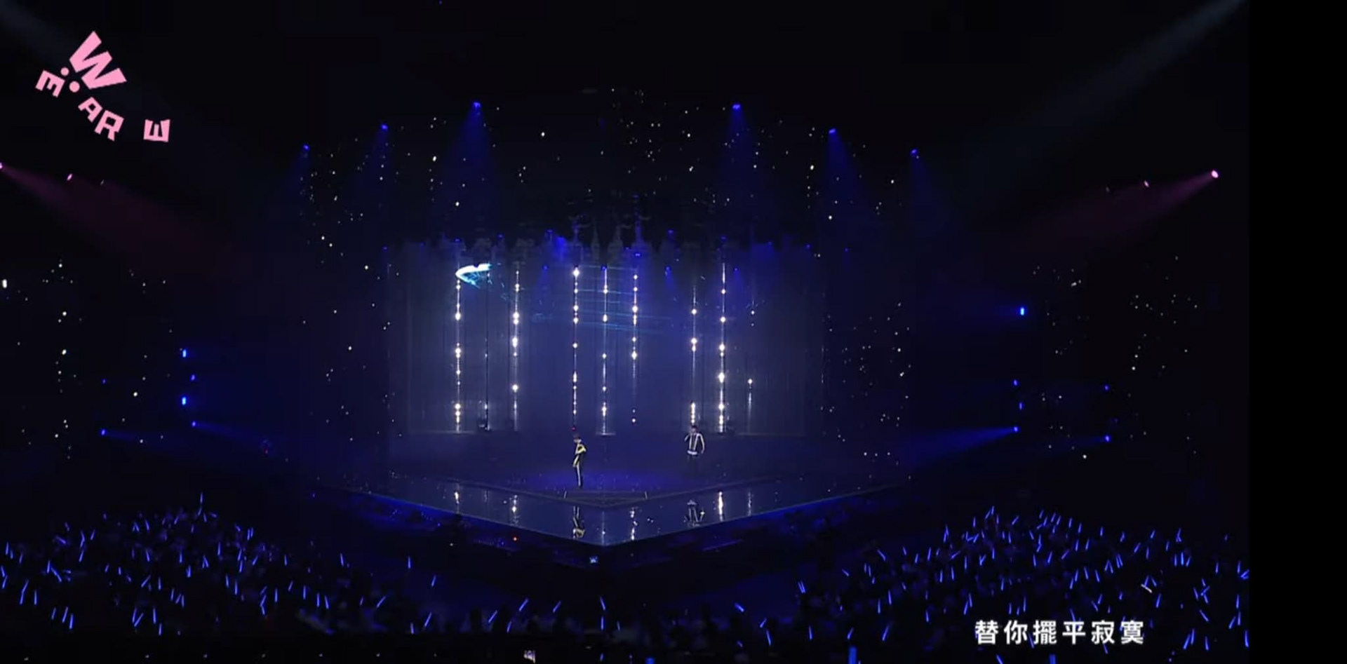
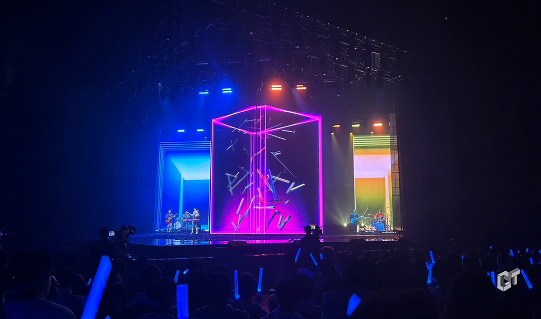
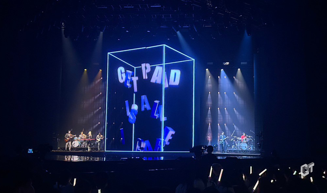
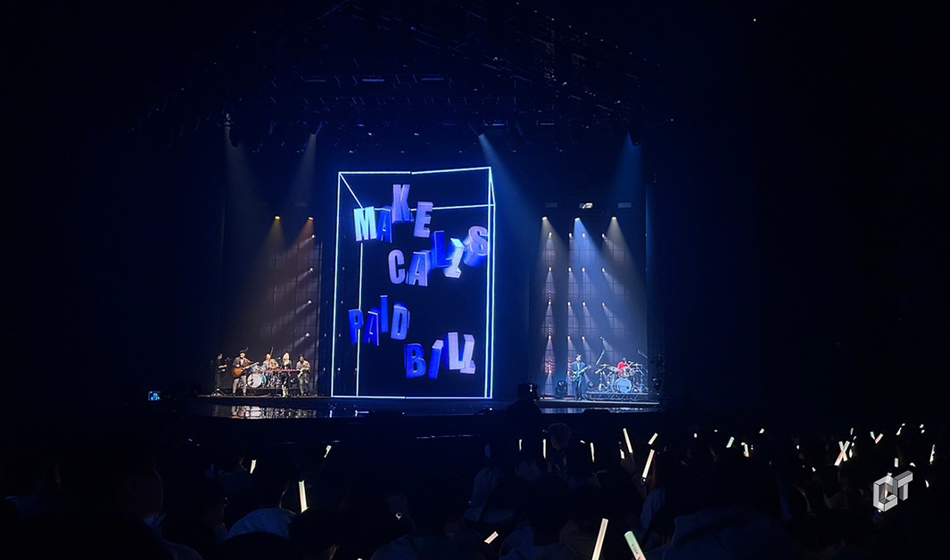
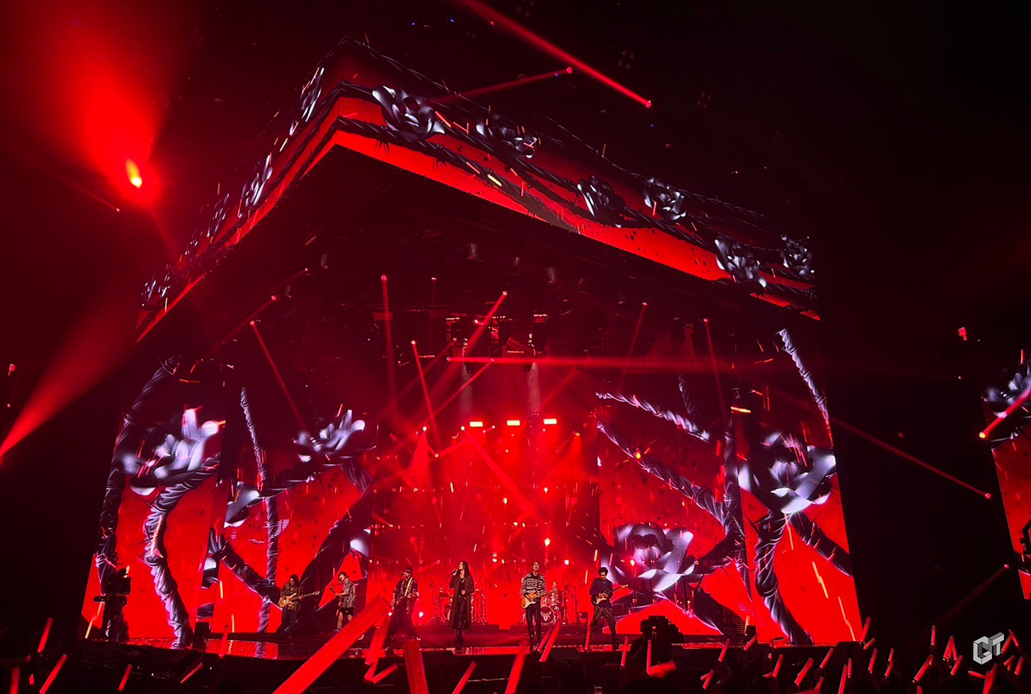
We are Confident 怕胖團PAPUN BAND/麋先生MIXER/好樂團GoodBand/甜約翰Sweet John/JADE
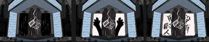
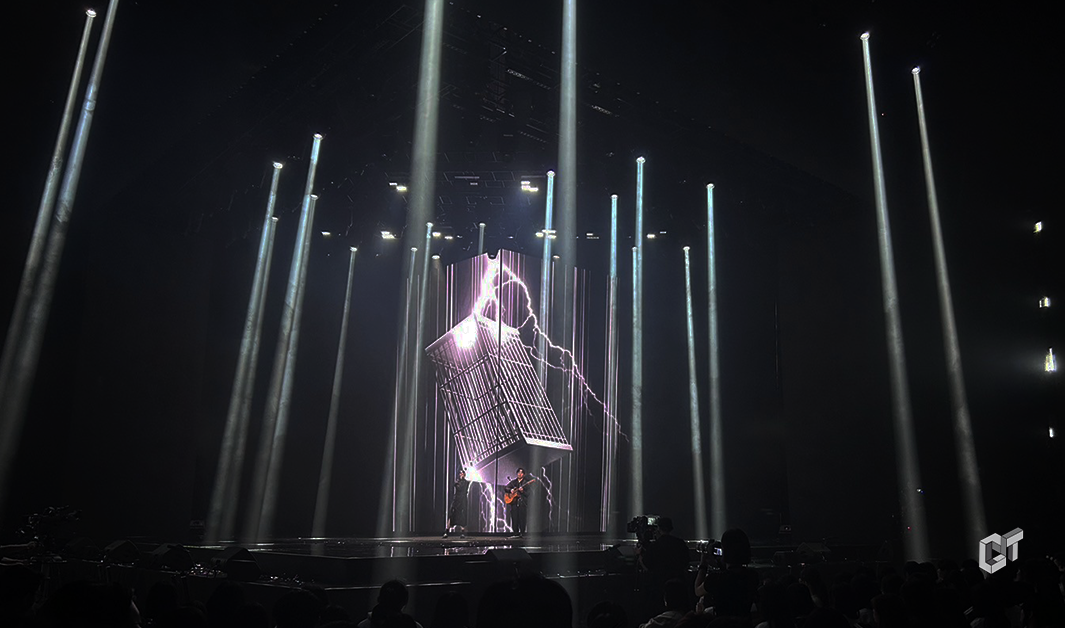
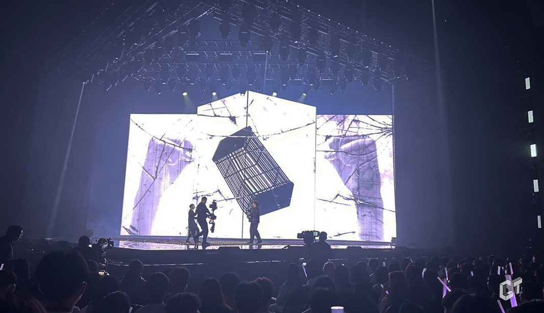
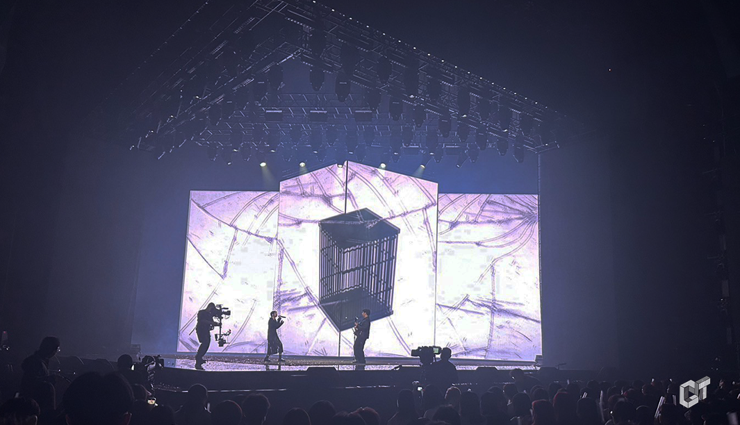
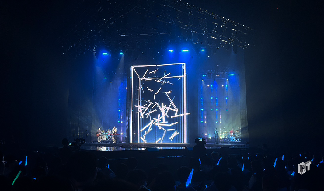
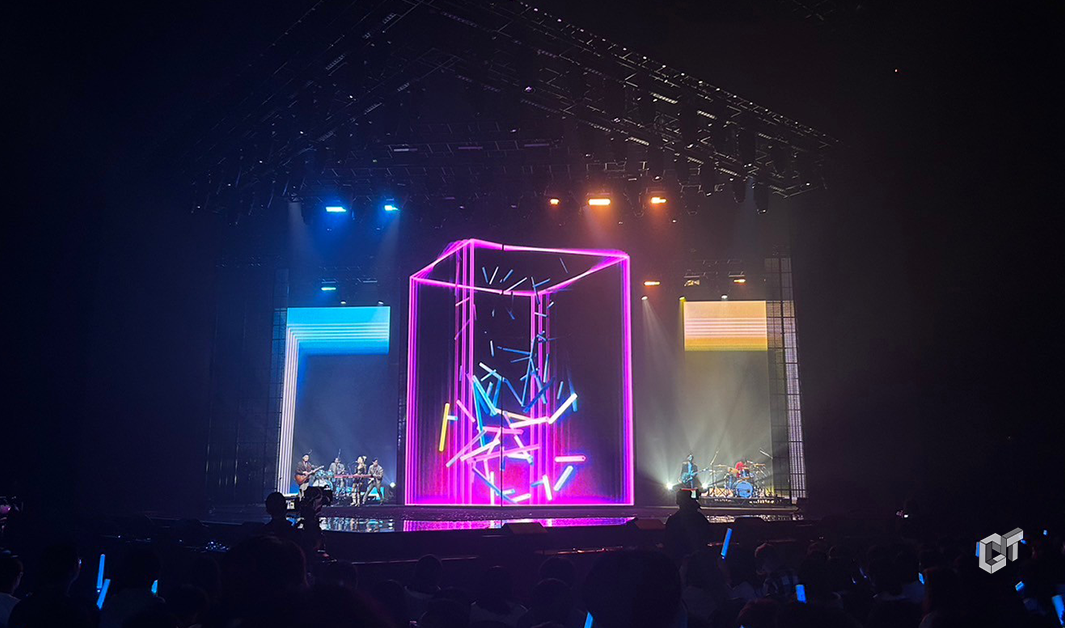
本設計的主旨在於透過舞台陣型與透視的運用,創造出虛實交錯的視覺不確定性,引導觀者進入虛實之間的場景。 視覺風格上,以較為文青的風格,運用幾何的元素及符號,來表達音樂的豐富層次和情感深度。從簡單到複雜的層次演進,不僅在視覺上呈現了從局部到整體的磅礴變化,也在情感上建立了從靜謐到激昂的過渡,展現出五團的氣勢
The essence of this design lies in the use of stage formations and perspective to create a visual ambiguity that blurs the lines between reality and illusion, guiding viewers into a scene that floats between the tangible and the intangible. Visually, the style leans towards a more artistic and literary approach, utilizing geometric elements and symbols to convey the rich layers and emotional depth of the music. The progression from simple to complex not only visually represents a majestic transition from the partial to the whole but also emotionally constructs a journey from tranquility to fervor, showcasing the presence of the five bands.
設計手稿 Hand Scripts
設計手稿 Hand Scripts

設計手稿 Hand Scripts
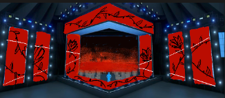
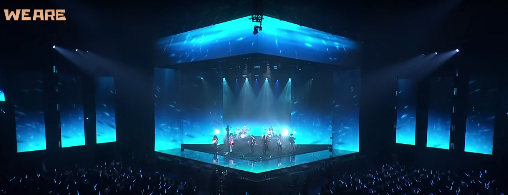
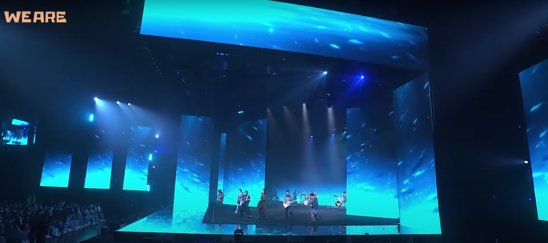
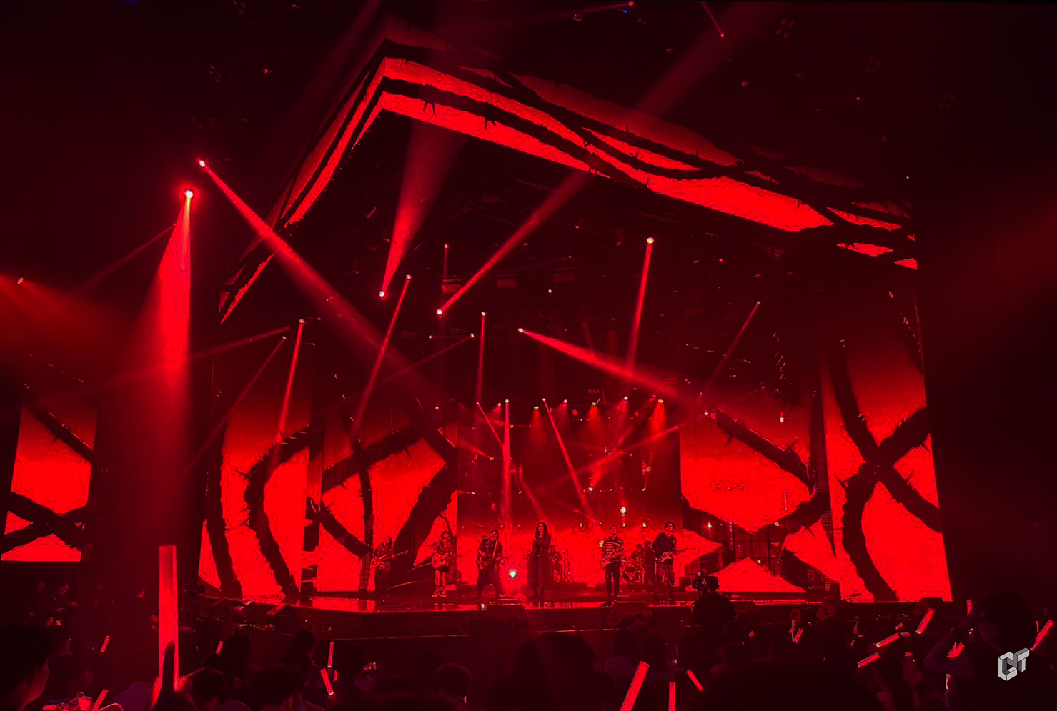
設計手稿 Hand Scripts

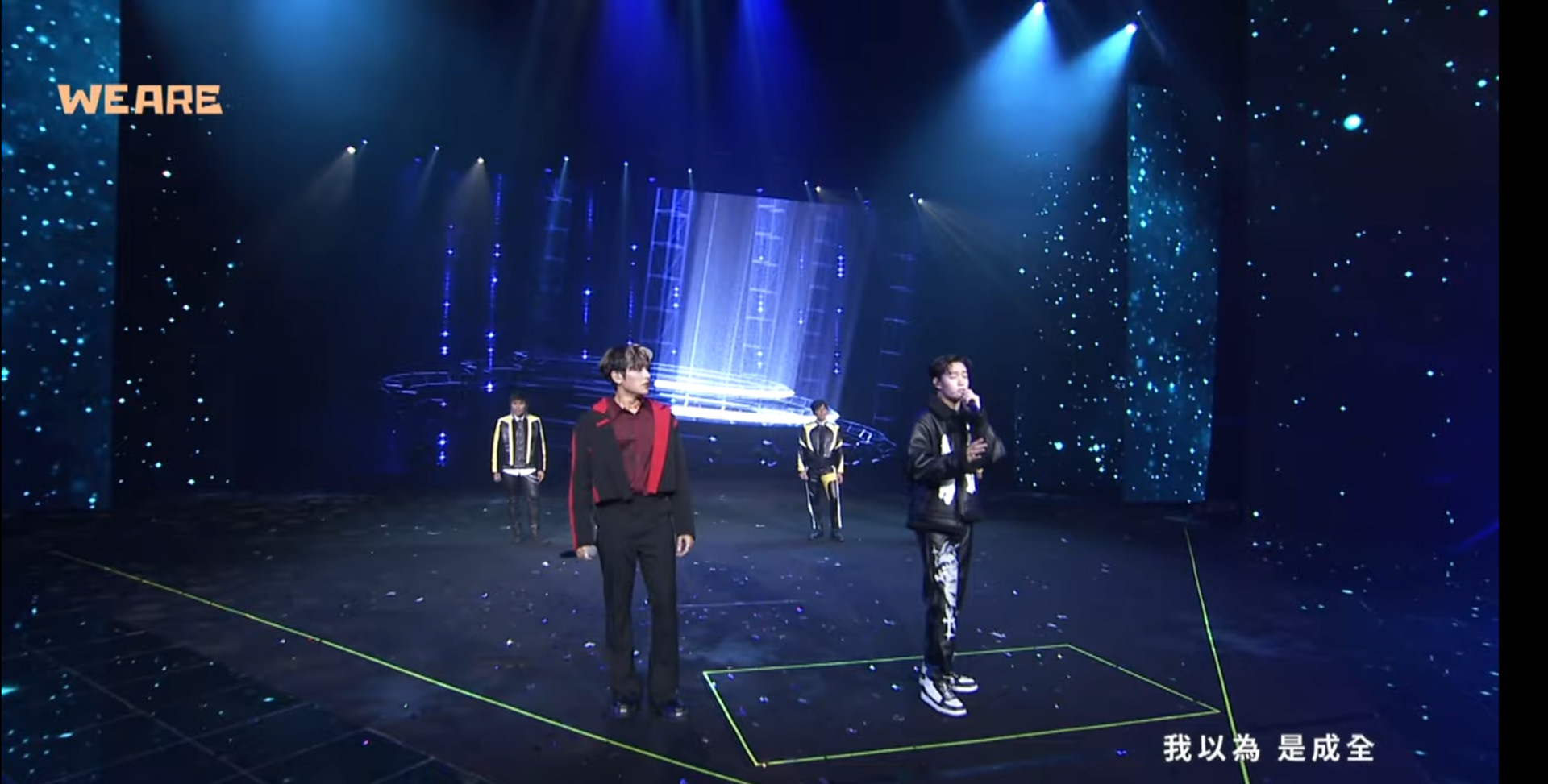
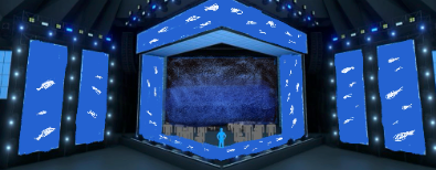
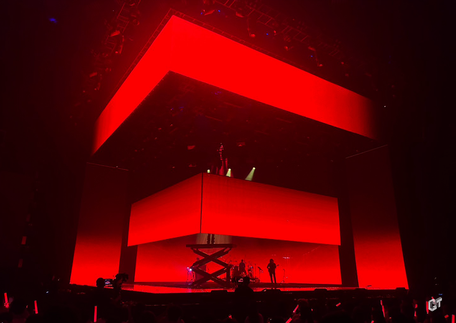
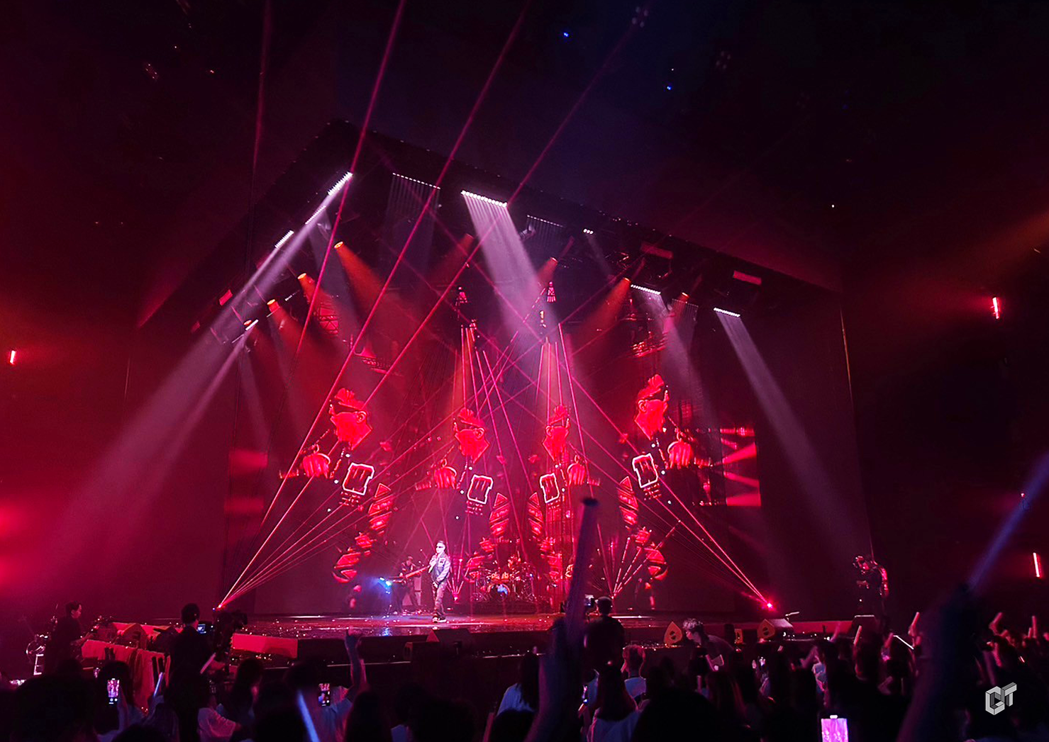
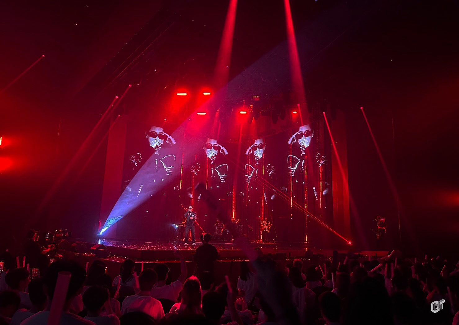
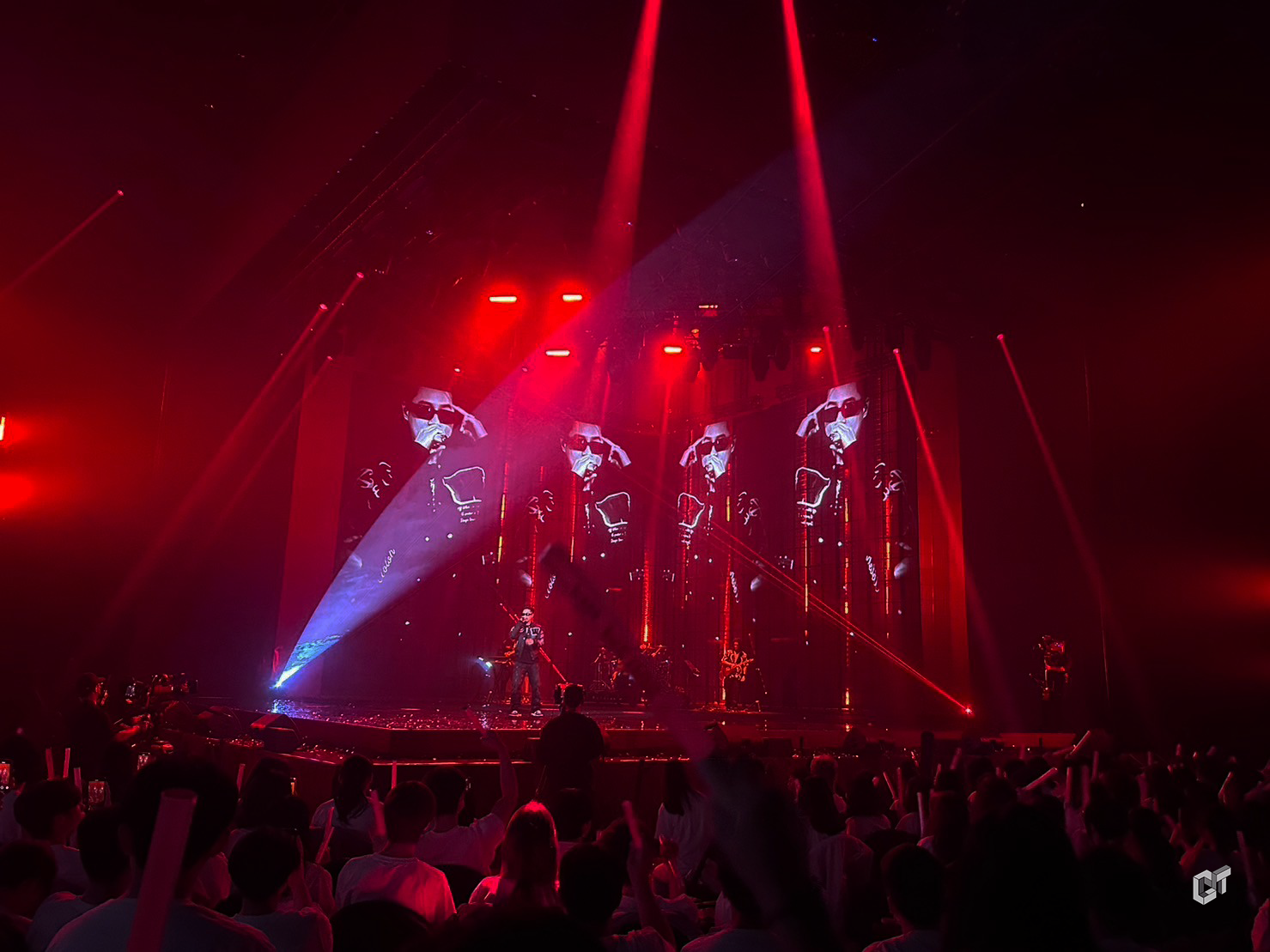
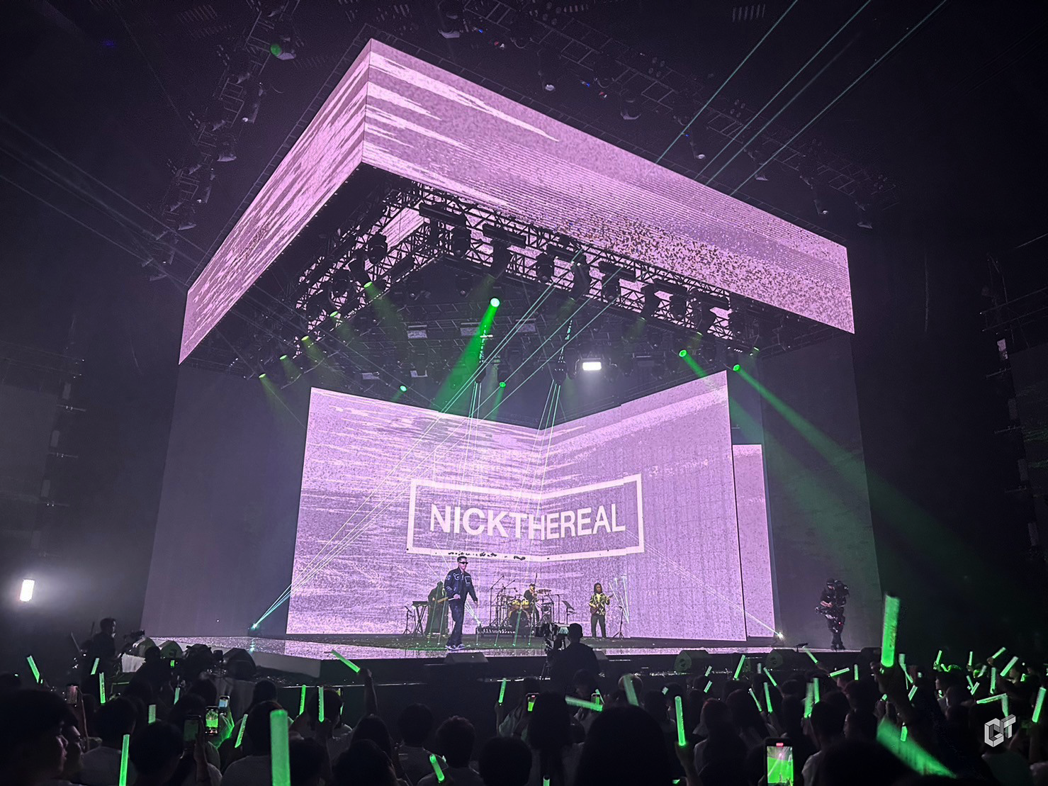
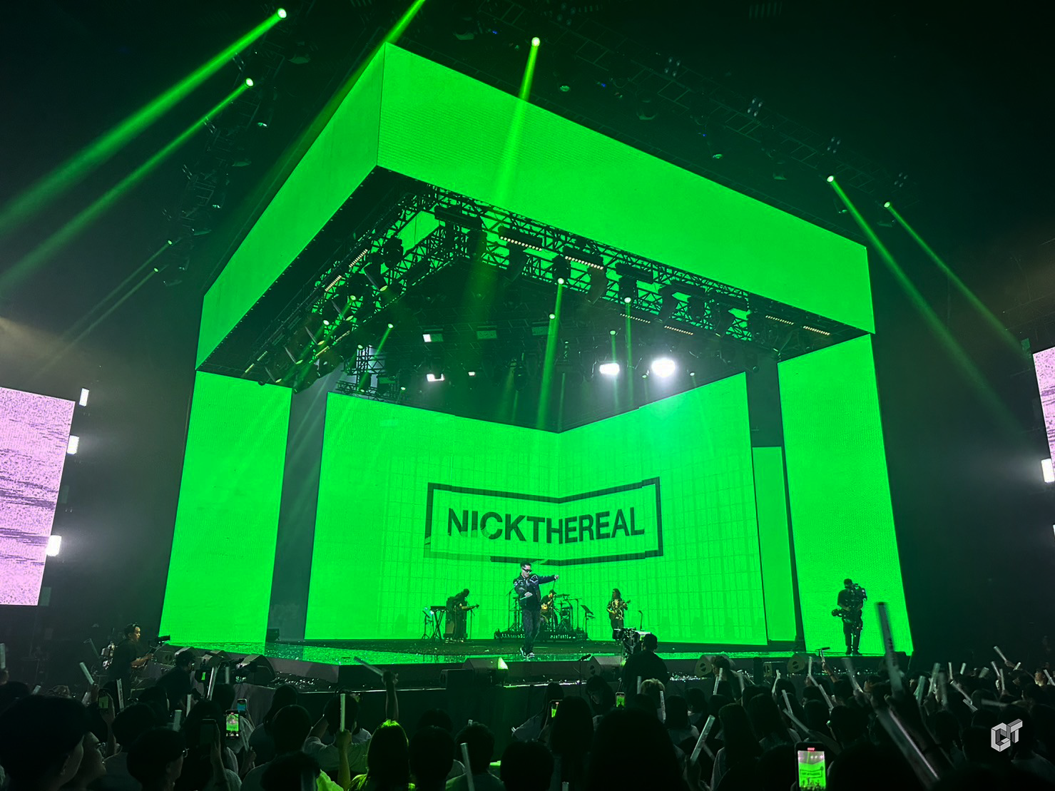
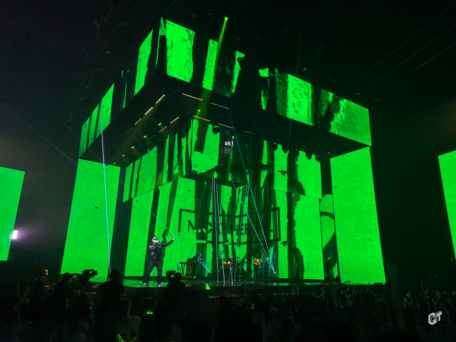
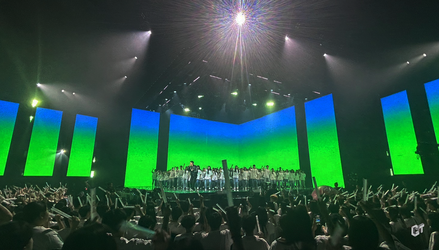
We are the Real 周湯豪
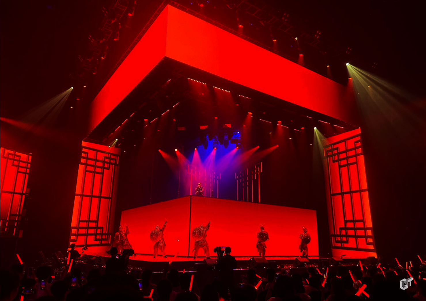
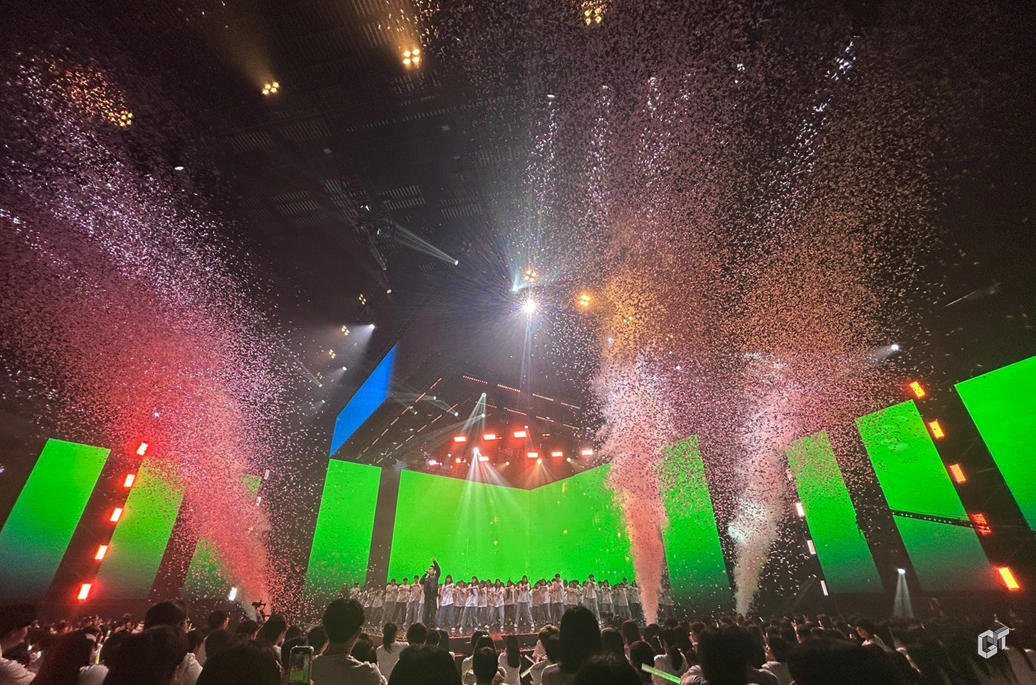
在這次的演唱會視覺設計中,周湯豪與明華園的共演 及他個人的單曲表演,乃至於與千人學生的壯觀共演。本設計的主軸在於展現一種極簡卻清晰地凸顯表演者姿態的視覺風格,透過舞台陣型的多變化,與周湯豪個人歌曲的節奏明快相結合,創造出獨特的觀賞體驗。 舞台設計巧妙運用了簡約的線條與形狀,將視覺焦點集中於表演者,同時利用燈光與雷射技術,加強了表演的動態節奏感,展現了集體表演的壯觀與和諧,進一步強化了壓軸演出的整體效果。
We delved into the collaboration between Nick Chou and Ming Hwa Yuan, his solo performances, and the spectacular joint performance with a thousand students. The core of this design is to showcase a minimalist yet clear visual style that accentuates the performers' postures, combining the versatility of stage formations with the upbeat rhythm of Nick Chou's songs to create a unique viewing experience.
The stage design cleverly utilizes simple lines and shapes to focus the visual attention on the performers, while the use of lighting and laser technology enhances the dynamic rhythm of the performance. This not only showcases the grandeur and harmony of the group performance but also further strengthens the overall effect of the show.
Production Credit
指導單位Instructor|文化部(Logo)
主辦單位Organizer|文總(Logo)
出品人Producer|李厚慶Hou-Ching LEE
總監製Producer|黃竫蕙Huang Ching Hui/喻小敏Stella YU
監製Producer/創意總監|必應創造 B'in Live Production
音樂總監Music Director|柯智豪Blaire Ko(柯智豪音樂工作室Blaire Ko Studio)
執行顧問Executive Consultant|丁度嵐Baboo Ding(高雄流行音樂中心Kaohsiung Music Center)
總統籌Chief Coordinator|葉敏慧YEH,Ming-Hui
統籌Coordinator|江雅珍Ya-Chen Chiang
節目製作Creative Direction|必應創造 B'in Live Production
監製Supervising Producer|楊宗錞 Spring Yang
創意總監Creative Director|潘筱晴 Erin Pan
藝人統籌Artist Coordination|曾琴 Tseng Chin
製作人Producer| 潘筱晴 Erin Pan/鐘啓銓 Chi-Chuan Chung
執行製作人Show Director|吳欣儒 Hsin Ju Wu/施玟伃 WENYU SHIH
視覺設計Visual Design |固態視覺影像有限公司 Goodtime Design Studio
視覺總監Art Director|鄭宸宇 CHEN YU CHENG
動畫製作Animation Design|
鄭宸宇 CHEN YU CHENG/劉音秀 YINSIOU LIOU/王克謙 KOCHIEN WANG/吳羿伶 YI LING WU/何荔芳 LI FANG HE /陳怡靜 YICHIN CHEN
/莊祿平 LUPING CHUANG/王永霖 YONGLIN WANG/張鑫濃 HSINNUNG CHANG/林旻葶 MINTING LIN/鍾穎陶 WINGTO CHUNG/詹游丞 YO CHENG ZHENG /張佳涵 JIA HAN CHANG
插畫設計 Illustration| 磊勒丹.巴瓦瓦隆 reretan pavavaljung
書法字設計Calligraphy |林佳穎 CHIA-YING LIN
視覺執行Visual Executive|鄭宸宇 CHEN YU CHENG/莊祿平 LUPING CHUANG/陳怡靜 YICHIN CHEN